

A wealth management website usually shows its real weakness the moment a prospective client lands on it and cannot tell what the firm does, who it serves, or what to do next. That failure is rarely visual alone. It usually comes from a site built like a brochure instead of a business tool, where compliance, advisor workflows, and conversion paths were handled in separate rooms instead of one connected system.
Wealth management website design works best when the homepage, service pages, disclosures, and contact paths all support the same decision process. The visitor needs trust quickly, the compliance team needs clarity, and the advisory team needs a site that helps move qualified prospects forward. That balance is hard, but it's exactly where strong firms separate themselves from generic financial websites.
Table of Contents
- Defining Strategy and Compliance Foundations
- Designing for Trust with UX and Information Architecture
- Creating SEC-Aware Content That Converts
- Choosing the Right Technology Stack and Integrations
- Driving Growth with Local SEO and Lead Generation
- Executing a Smooth Launch and Planning for Optimization
Defining Strategy and Compliance Foundations
A strong website starts as a business asset, not a design exercise. Before layouts or copy appear, the firm needs to define who the site is meant to attract, what action those visitors should take, and where the site has to support the advisory workflow rather than interrupt it. That matters because wealth management sites are judged in two places at once, by prospective clients and by internal reviewers who need the content to be accurate, current, and properly framed.
Start with the firm's decision model
The discovery process should begin with three questions. Who is the ideal client, what problem brings that person to the firm, and what proof does that person need before contacting an advisor? Those answers shape the homepage, the service architecture, and the wording of every major call to action.
A useful way to keep the project honest is to separate business goals from page preferences. A founder may want to highlight the firm's history, while prospects may care more about the services page, team credentials, or how the client experience works. The site should follow the buyer's path, not the internal org chart, and that principle aligns with advisor-focused guidance that recommends a full services page, ideally with separate pages for each service, because prospects need concrete proof of what's offered. Proper Expression's advisor website guidance makes that structure explicit, and it fits the way financial buyers evaluate risk.
Practical rule: If a page does not help a prospect understand fit, process, or proof, it should not control the navigation.
Build compliance into the structure, not the cleanup
Compliance cannot be a final review layer. It has to shape the page system from the start, which is why a repeatable compliance-first framework with modular page blocks is so effective. Recommended modules include a homepage value proposition, services pages, team and credentials, client experience or onboarding, insights content, and an editable legal or disclosure area, then wireframes should be tested before visual design begins. That workflow comes directly from a practical wealth-management website methodology described by the Select Advisors Institute.
A clean foundation also keeps the editing process manageable after launch. Role-based CMS editing, visible disclosures, and modular legal blocks reduce the chance that a routine update turns into a compliance scramble. For firms that want a practical resource for financial advisors, the right content system should support both lead generation and regulated review without forcing one team to guess what another team needs.
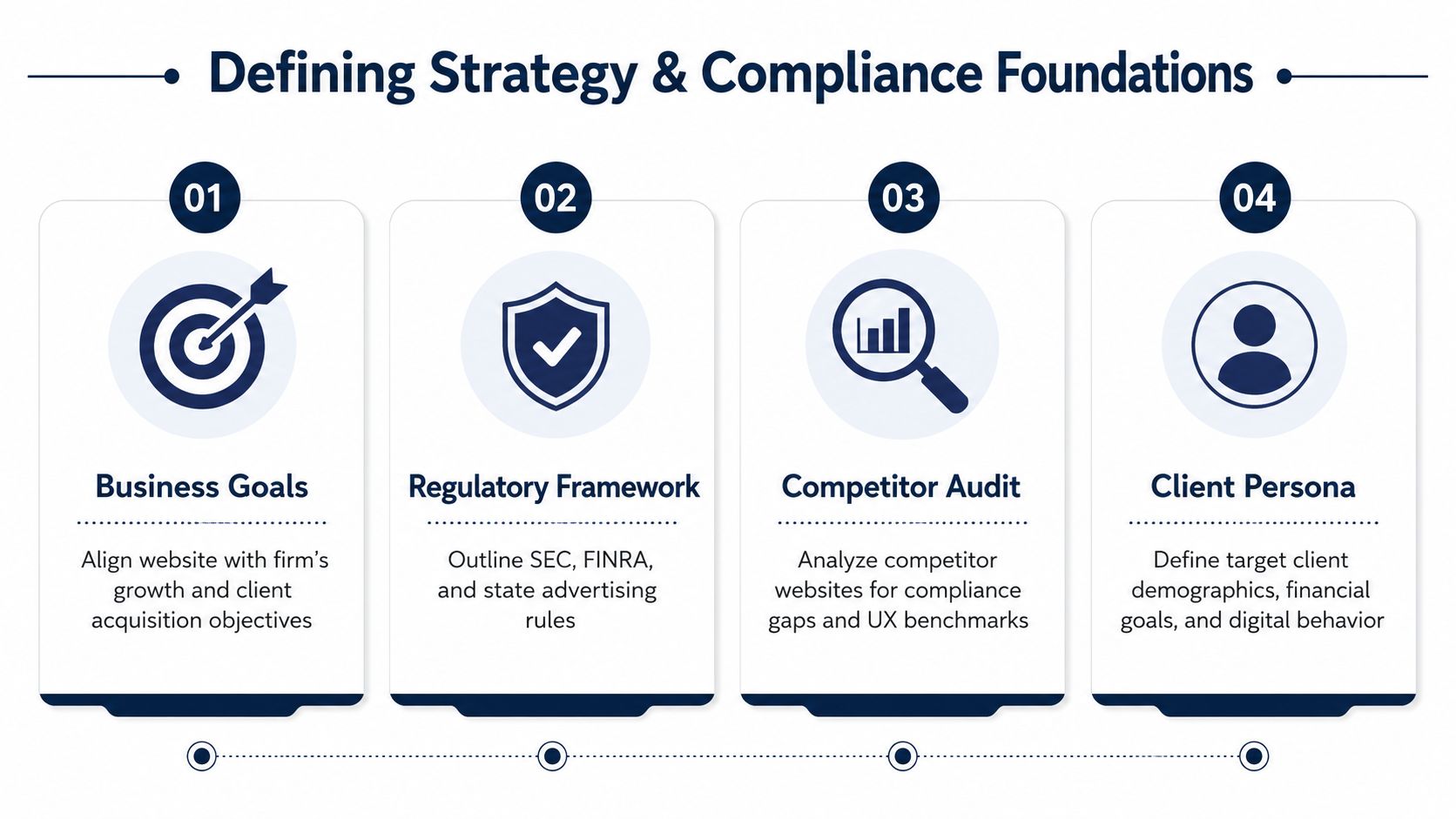
The core checklist is simple, even if the work behind it is not.
- Define the audience: Clarify the client profile, the assets or situations that matter, and the financial questions that create urgency.
- Set the conversion goal: Decide whether the site should drive consultation requests, onboarding inquiries, or a mix of both.
- Map the compliance layer: Identify disclosures, archived content needs, and any page-specific review requirements before copywriting starts.
- Plan the page modules: Lock the homepage, services, team, process, and insights structure before design polish begins.
That foundation prevents the common mistake of designing a beautiful site that later has to be reworked because the disclosure logic, service hierarchy, or review workflow never fit the original plan.
Designing for Trust with UX and Information Architecture
A prospect can form an opinion of a wealth management site almost immediately. If the page is slow, cluttered, or hard to read on mobile, the visitor starts questioning whether the firm handles detail with care. Trust also depends on structure, which is why financial website guidance often recommends a short, clear main navigation and a page set that feels easy to scan. The advisor web-design benchmark points to a site that communicates quickly without making visitors work for orientation.
Make the first click obvious
The homepage should give visitors one clear value proposition, one obvious next step, and a layout that directs them toward services, people, and proof. If the navigation is too broad or the labels try to sound clever, the site forces people to interpret the firm's structure before they understand the offering.
Prospects usually evaluate a firm in a predictable order. They want to know what services exist, who is behind the firm, how the process works, and whether the business feels credible enough to keep exploring. A simple top-level menu often performs better than a crowded menu with nested jargon, especially in wealth management where clarity is part of the brand signal.
Photography should support that same message. Firms refining advisor images can use professional corporate headshot styles as a reference point, because the visual treatment should reinforce the same trust cues the copy is trying to establish.
Clean navigation is not a style choice. It is a usability signal that tells the visitor the firm understands how people make decisions.
Wireframe the journey before the visuals
Wireframes should map the path from curiosity to inquiry. A visitor needs a logical route from the homepage to service detail, then to proof, then to a contact action that does not feel abrupt. That sequence can use a consultation button, a form on a high-intent page, or a low-friction contact prompt, but the order has to feel intentional.
Accessibility belongs in the wireframe phase too. Readable text sizes, labels for every form field, alt text for images, and layouts that stay legible on mobile devices are not optional details. They shape how usable the site is for real visitors, and they also reduce the chance that a polished design hides a broken experience.
A testimonial page can support the trust path when it is easy to find and easy to assess. The practical guidance in Advisor Momentum's testimonial page guidance fits here because social proof only helps when visitors can reach it without digging through the site. The same rule applies to advisor team pages, where images, bios, and credentials should work together instead of competing for attention.
Mobile design needs the same discipline as desktop. Financial-services usability guidance recommends fast load times, readable typography without zooming, and touch-friendly navigation because mobile often becomes the first real test of trust. If a site loads slowly or requires pinch-to-zoom, it suggests the firm may be careless in other parts of the client experience too.
Creating SEC-Aware Content That Converts
A wealth management site has to earn interest and survive review at the same time. The content has to move the right visitor toward action, while still holding up when compliance reviews every promise, credential, and claim. Generic copy usually fails because it sounds polished but says too little to create trust and too much to create risk.
Build service pages that prove fit
A practical advisor website guide recommends a full services page and, when the firm's offering is broad enough, a separate page for each service. The point is not decoration. It gives compliance and marketing the same foundation, so the firm can state who it serves, what it offers, and what problems each service is meant to solve without forcing visitors to infer the details. Credibility signals can also include performance statistics or assets under management, as long as the firm is prepared to support those claims and use them consistently. That approach is reflected in the guide on financial advisor website design, and it matches how prospects assess risk before they reach out.
Service pages should answer three questions quickly. What does the firm do, who is it for, and how does the process work? If those answers hide behind broad phrases like “custom strategies,” the page may pass a legal review and still fail as a sales page.
Calls to action should be direct and low-friction. “Schedule an introductory call,” “Request a conversation,” and “See how the process works” are stronger than vague promises because they show the next step without implying a guaranteed outcome. A compliant site can still persuade when it stays grounded in process, audience, and proof instead of performance hype.
Write human bios and cautious proof
Advisor bios should give a prospect a reason to trust the person, not read like a résumé dump. The details that matter are the ones that help someone judge fit, specialty, approach, and how the advisor handles client service. Generic accolades do little if they do not tell the reader what working with the firm will feel like.
Useful proof is specific, observable, and relevant to the service being sold.
Testimonial language, case-style examples, and process explanations can help, but only when firm policy allows them and only when the claims can be supported. The same standard applies to any reference to results. Specificity matters more than volume, because a small amount of credible detail usually outperforms broad praise that sounds recycled.
A firm can also use plain-language pages to explain how it works with clients, how onboarding begins, and what happens after the first inquiry. That kind of content reduces friction because it answers the questions buyers are already asking internally. The site feels less promotional and more prepared, which is usually what the right prospect wants on a first visit.
Choosing the Right Technology Stack and Integrations
The technology stack decides how the site behaves after the design is approved. A clean interface still fails if the CMS is hard to update, the client portal is disconnected, or the structure makes compliance edits painful. For advisory firms, the right stack is the one that supports governance, speed, and maintenance without turning every change into a technical project.
Match build type to firm complexity
Pricing is a useful proxy for complexity because it shows how much infrastructure the site needs. A mid-sized RIA redesign typically ranges from $20,000 to $75,000, while custom enterprise builds for firms with $5B+ AUM can exceed $150,000 because they often require custom APIs, client dashboards, and more advanced technical architecture, according to Lounge Lizard's wealth-management redesign guidance. Template builds can sit in the $3,000–$25,000 range, which is a very different problem set.
That spread matters because a cheap build can become expensive if the team needs heavy revisions later. Firms with straightforward needs may be fine with a lighter build, while larger practices usually need deeper integration, more rigorous content governance, and a structure that will not collapse under future updates. The site should fit the firm's operating model, not just the initial budget.
Prioritize the plumbing that supports growth
A wealth management website works best when it connects cleanly to the firm's other systems. CRM handoff, client portal expectations, tracking for form submissions, and editorial approval flows all need to be considered together. A site that cannot route leads cleanly or keep regulated content current will create operational drag no matter how polished it looks on the front end.
The technical side also affects compliance and trust. Fast-loading pages, secure hosting, and continuous maintenance are not optional extras. Technical guidance for wealth-management sites recommends loading content only when it enters the viewport, reducing unnecessary plugins, compressing images and video, and maintaining the site over time so performance does not degrade.
A practical implementation path usually looks like this:
- Template-driven builds: Best when the firm needs speed and a modest content system.
- Semi-custom builds: Better when the firm needs more control over layout, content hierarchy, or integrations.
- Fully custom builds: Better when the firm needs complex workflows, dashboards, or deeper systems architecture.
The right choice is rarely about design taste alone. It is about how often the firm expects to edit content, how much review friction it can tolerate, and how much the website needs to behave like an operational platform instead of a static marketing presence.
Driving Growth with Local SEO and Lead Generation
A compliant site that nobody finds is still underperforming. Visibility is where wealth management website design meets acquisition, and local search usually gives that work its first measurable return. Prospects often arrive with a city name, a neighborhood, or a specific service in mind, so the site needs enough structure for search engines and visitors to match those queries without confusion.
Make local intent easy to recognize
Location-specific landing pages work when they answer real regional questions, not when they just swap in a city name. A page for a metropolitan market should show who the firm serves there, which services matter in that market, and how the firm's process fits that audience. That matters even more for firms that serve several regions and need separate messaging for different client segments.
Google Business Profile management also matters because it supports discovery outside the main website. The profile should match the firm's service language, contact details, and office information so prospects do not see contradictions between search results and the site. In a regulated industry, consistency is part of credibility.
Content can support local discovery when it stays grounded in the questions prospects ask before they reach out. Retirement transitions, tax-aware planning, investment oversight, and client onboarding often become search topics because they map to real decision points. The goal is not volume for its own sake, it is to create the pages that a qualified prospect needs before they are ready to engage.

Treat mobile search as the front door
Mobile usability is not a nice-to-have in financial services. Many local searches start on a phone, and that first screen often decides whether the firm gets a second look on desktop. Industry guidance recommends keeping page speed under 3 seconds, using readable typography without forcing zoom, and implementing touch-friendly navigation to preserve trust on mobile. That matters because a slow page or cramped layout can make a regulated firm feel harder to trust before a visitor reads a single line of copy.
The strongest local lead generation pages do three things well. They show the firm's relevance to the area, they reduce uncertainty, and they make the next step obvious. If those pages are thin, vague, or overloaded with generic copy, the site may attract traffic without moving anyone closer to a conversation.
Executing a Smooth Launch and Planning for Optimization
Launch day is a checkpoint, not a finish line. The final pre-launch review should cover content accuracy, form testing, disclosure placement, mobile rendering, analytics tracking, and compliance approval for every page that can change the user's understanding of the firm. A site that goes live without that process usually creates avoidable fixes in the first week.
Use a launch checklist that includes governance
The practical risk before launch is not just a broken button. It is a page that loads correctly but sends the wrong signal, omits a required disclosure, or routes a lead into an unmanaged inbox. Those problems are harder to spot than visual bugs because they often look normal until a prospect or reviewer catches the mismatch.
Analytics setup should happen before launch so the firm can see what visitors do from day one. The internal guide at Advisor Momentum's analytics setup page is relevant here because tracking is only useful when it is in place before traffic starts arriving. Without it, the firm loses baseline data and has to guess which pages are helping and which are creating friction.
A launch that skips measurement usually creates a second project later, and that second project is always more expensive.
Optimize after launch, not instead of launch
After the site goes live, the focus should shift to behavior. Which pages attract inquiry, where do people leave, and which calls to action get ignored? Heatmaps, form reviews, and A/B testing help answer those questions, but only if the site launched with clean tracking and a clear conversion goal.
The bigger lesson is that a wealth management website is never finished. Content drifts, regulations change, and user expectations change with it. The firms that keep their sites effective are the ones that review performance regularly, update disclosures promptly, and refine the structure based on actual visitor behavior rather than design preference alone.
Advisor Momentum builds compliance-ready websites, SEC-aware content systems, and conversion-focused digital programs for RIAs, wealth managers, and bank teams. For firms that want a website built around trust, workflow, and lead generation, visit Advisor Momentum and see how a compliance-first approach can support the next redesign.
