
Most advisory firms are still losing prospects before the first call. The website looks respectable, the logo is polished, the LinkedIn profile is active enough, and yet the firm still sounds like every other firm in the market. That's the problem with financial advisor branding today. It's not a design issue first, it's a differentiation issue, and the market keeps proving that many firms know branding matters while still failing to use it well.
A major 2026 benchmark found that 73% of RIAs view branding as critical for differentiation, yet 42% of CNBC Top 100 financial advisory firms still landed in the “generic” range for brand originality, with an average originality score of 5.86/10 and only 6 of 100 firms scoring 8/10 or higher (financial advisory branding statistics). That gap is the whole story. Firms say they want distinctiveness, then publish messages that could belong to anyone.
The fix is not more decoration. It's a compliance-first brand system that clarifies who the firm serves, what it solves, and how it communicates without getting flattened by review. In regulated markets, the brand that survives scrutiny is usually the one that was built with scrutiny in mind from day one.
Table of Contents
- Why Most Advisor Brands Blend Together
- Building the Strategic Foundation of Your Brand
- Naming, Visual Identity, and the Brand Guide
- Website, Content, and LinkedIn as One System
- Video, Ads, and Social That Survive Review
- Client Experience, Measurement, and Brand Operations
- Branding Myths That Keep Advisors Generic
Why Most Advisor Brands Blend Together
The average prospect doesn't see a marketplace full of nuanced positioning. They see a row of firms saying they help with retirement, investments, tax planning, and peace of mind. The tone is polished, the headshots are professional, and the language is interchangeable. That's why the reader's firm can feel invisible even when the service is strong.
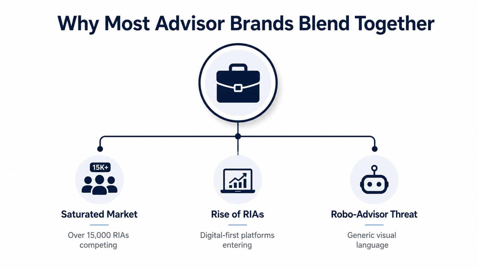
The market rewards sameness unless the firm interrupts it
The crowded advisory market pushes firms toward safe language. A generic promise feels easier to approve, easier to defend, and easier to publish, but it also makes the firm easier to ignore. The result is that prospects default to price, convenience, or whatever looks most familiar. That's a terrible place to compete if the firm has deeper expertise.
A stronger brand doesn't start with a better logo. It starts with a sharper position in the market, because financial advisor branding is a positioning tool, not a visual accessory. It tells a prospect why one firm deserves attention before the first consultation ever happens. In a category where portfolios, planning services, and advice models often sound similar, clarity is the differentiator.
Practical rule: if a homepage sentence could fit five competitor firms with only the logo changed, it's too weak.
The gap between importance and execution is also visible in buyer behavior. Independent market research found that about 14% of affluent investors said a firm's brand was “extremely important” when choosing a primary investment advisor, and over 36% said it was extremely important when choosing another investment advisor (Does branding still matter?). Among advisors, 59% rated trust as “extremely important”, ahead of history of superior performance at 49% and ease of doing business at 43%. That's not a cosmetic signal. That's a trust filter.
Compliance makes the problem worse if the brand was lazy from the start
Most firms underinvest in the brand architecture, then ask compliance to approve vague copy that was already weak. That creates a predictable outcome. The messaging gets scrubbed until it's safe, and safe often means forgettable. The brand then looks professional, but not memorable.
A compliance-first brand flips the sequence. The firm defines a niche, a proof point, and a reusable message system before design gets involved. Then the website, LinkedIn presence, and public materials all sound like the same firm, not a collection of unrelated assets. That's what makes a brand survive review and still feel distinct.
Building the Strategic Foundation of Your Brand
Strategy comes before design because design without strategy is just style. A firm can choose prettier colors and still sound broad, diluted, and hard to remember. The work begins by identifying who the firm is for, what problem it owns, and what white space sits between the firm and everyone else saying the same thing.
A useful starting point is the target plus promise plus proof formula. The target is the segment the firm wants. The promise is the outcome or change the client wants. The proof is the reason that promise sounds credible. That one sentence becomes the backbone of everything else.
The logic is straightforward. If the audience is vague, the message will be vague. If the proof is missing, the promise will sound like marketing fluff. If the niche is fashionable but not underserved, the firm will blend in again within a few months.
White space beats vague authenticity
Many advisors think branding means “being authentic.” That sounds good and usually goes nowhere. Better branding asks a harder question, who is already under-served by the market, and where does this firm have a real right to speak? That's the white-space question, and it's where a lot of generic firms lose.
Existing client data usually reveals the answer faster than brainstorming does. Look for recurring demographics, job types, wealth events, planning stress points, and behavior patterns that already show up in the client base. Then test whether those people are underserved by peer firms in the market, not just interesting to talk about. That validation step matters more than trendiness.
The best niche is rarely the broadest one. It's the one the firm can serve credibly for years without stretching the truth.
The financial planning community has also pushed a more concrete self-assessment process. A guide from the Financial Planning Association recommends asking what work feels energizing, what problems the advisor is drawn to solve, what they do exceptionally well, and what feedback comes up again and again (FPA personal brand guide). That's not fluff. It's a useful filter for matching actual strengths to a viable market position.
Write the positioning statement first
The cleanest positioning line is simple: target + promise + proof. For example, the format should sound like, “We help [target] achieve [promise] through [proof].” It's short enough to use everywhere and specific enough to guide naming, visuals, and content.
The point is not to create a slogan. The point is to force decisions. If the firm can't finish the sentence without generalities, the brand isn't ready yet. If it can finish it clearly, the rest of the system gets easier fast.
A useful brand voice then follows the position. If the target is discerning and the problem is complex, the voice should be calm, precise, and direct. If the target is seeking reassurance, the tone should still be clear, but warmer and less technical. The voice should never drift into generic financial-service comfort language unless that is the firm's point of view.
The more disciplined path is to anchor the brand around one stable statement, then let the supporting content prove it in different ways. That's the difference between a real brand and a random assortment of marketing assets. For a useful reference point on how advisors frame brand strategy in practice, see branding for financial services.
Naming, Visual Identity, and the Brand Guide
Once the strategic core is set, the tangible assets can finally do their job. A name, logo, color palette, and typography system should support the positioning, not fight it. If the strategy is clear and the visuals are random, the brand still fails. If the visuals are disciplined and the strategy is weak, the brand looks nice and converts poorly.
Choose a name that can survive review
A strong firm name usually does three things well. It sounds credible, it's easy to remember, and it doesn't force compliance into awkward gymnastics later. That means avoiding names that are clever but opaque, or descriptive but generic enough to vanish in a crowded search result.
The same discipline applies to taglines. A tagline should reinforce the positioning statement, not repeat industry clichés. “Helping families achieve financial freedom” may be approved quickly, but it says almost nothing. A better line names the audience or the planning problem with enough precision to matter.
A helpful way to judge any name or tagline is to ask whether it can work across a website, a printed brochure, a video intro, and a compliance review packet without getting rewritten each time. If it cannot, it's not ready. The brand should reduce friction, not create it.
The most effective naming systems also stay consistent with the visual tone. A practice serving retirees should not look like a speculative startup. A firm built around technical planning should not use playful typography that undercuts expertise. Consistency makes the firm easier to recognize and easier to trust.
Treat the brand guide like an operating manual
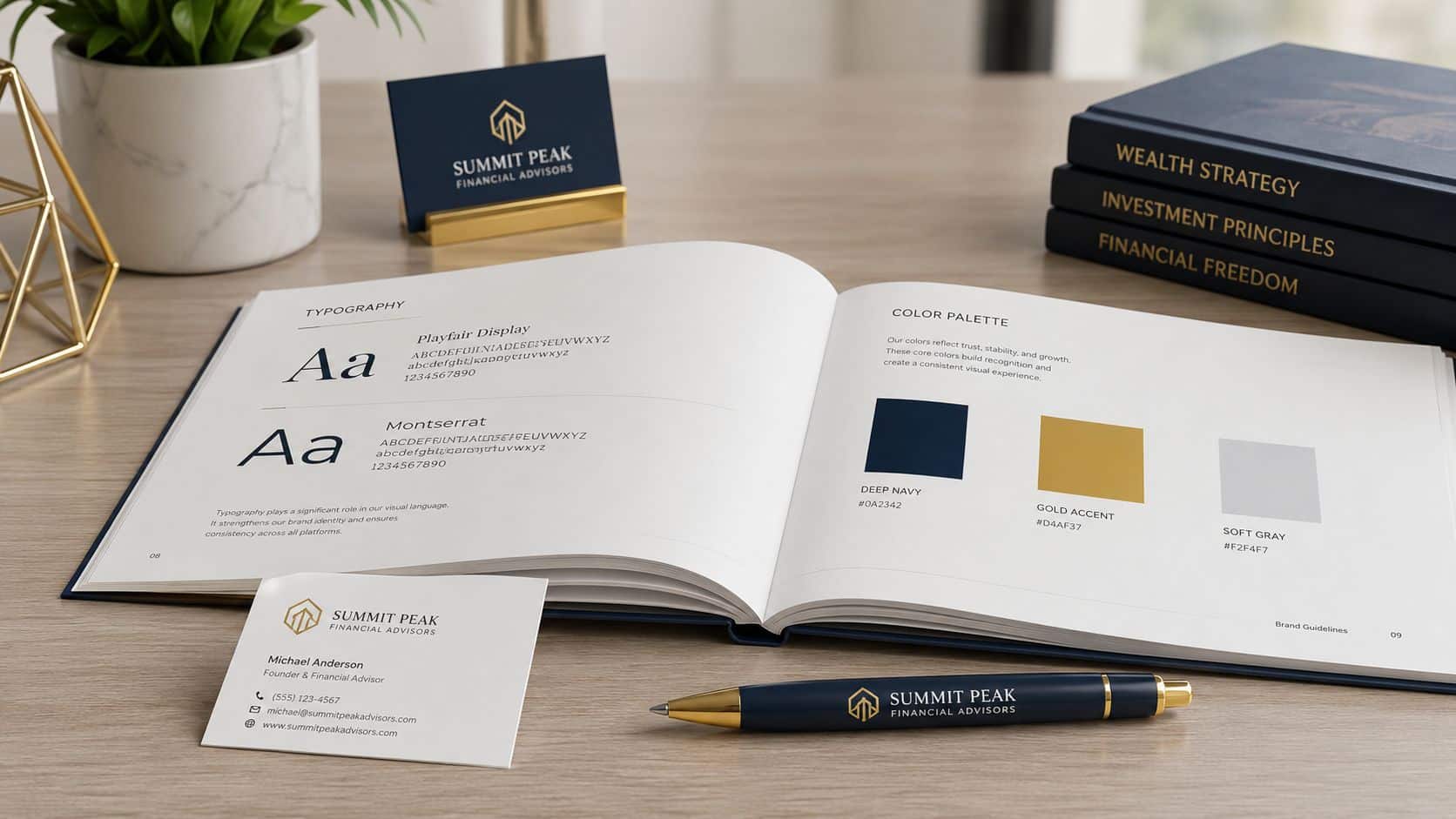
A brand guide is not a decorative PDF. It's the document that keeps the firm from drifting into inconsistent language, off-brand visuals, and endless revision loops. It should cover logo usage, color hierarchy, fonts, image direction, tone of voice, and pre-approved language patterns for public materials.
That guide also needs room for real-world use. Advisors write emails, publish bios, post on social media, and record videos. The guide should tell them what can vary and what cannot. If every advisor improvises their own version of the brand, the firm ends up sounding like five different businesses.
For a practical visual reference on color palettes that convert, the lesson is simple, the palette should support recognition and readability, not chase aesthetics for their own sake. A good palette helps people remember the firm and helps public-facing materials stay coherent across channels.
A brand guide that works in regulated firms also includes review-friendly language patterns. It should show how to describe services, outcomes, and expertise without making claims that invite unnecessary scrutiny. That keeps the brand distinctive without forcing compliance to rebuild every asset from scratch.
Website, Content, and LinkedIn as One System
The website, content program, and LinkedIn presence should behave like one message-consistency system. If the site sounds polished but the LinkedIn headline is vague, the brand leaks. If the blog posts are thoughtful but the contact path is messy, the brand leaks again. The point is to make every touchpoint feel like the same firm with the same point of view.
Build the site around conversion paths
The best advisor websites do not behave like brochures. They move visitors through a clear path from curiosity to trust to action. That usually means a homepage that states the positioning clearly, an about page that explains the firm's point of view, service pages that map directly to client problems, insight pages that answer high-intent questions, and a contact path that feels simple and compliant.
This structure matters because branding and conversion are tied together. Independent branding guidance for advisors recommends a one-sentence positioning statement, conversion paths on the website, SEO and content around high-intent questions, and centralized review for public materials to reduce compliance risk and improve trust-building efficiency (branding strategies for financial advisors). That's the right model. The website should not just explain the firm, it should move the right visitor toward the right next step.
Content then acts as the bridge. Answering specific client questions gives the firm a reason to exist in search results beyond its homepage. The content should be organized around the firm's core niche and the questions that niche asks. Broad generalities are weak. Clear answers are stronger, especially when they support the brand's stated position.
Keep the message consistent across channels
LinkedIn should not read like a different company. The headline, About section, post topics, and profile language should all reinforce the same niche and promise. Cetera's branding toolkit recommends a clear mission statement, a brief LinkedIn headline, an authentic About page, regular thought-leadership posts, and aligned messaging across channels (personal branding toolkit). That's the right sequence, because consistency builds credibility faster than cleverness.
Practical rule: if the website says one thing and the LinkedIn profile says another, the prospect trusts neither.
A useful way to think about distribution is that each channel should echo the same identity in a slightly different format. The website carries the full message. LinkedIn carries the professional proof. Email carries continuity. The brand becomes stronger when the repetition is deliberate rather than accidental.
For a deeper walkthrough on shaping the platform identity, a useful resource on how advisors can craft your professional LinkedIn story shows why the profile should read like a client-facing positioning tool, not a digital résumé. The same principle applies everywhere else. Strong branding is not about saying more, it's about saying the same thing well.
Video, Ads, and Social That Survive Review
Video and paid media are where weak brands get exposed fast. Advisors often create a polished clip or ad, then discover the language is too broad, too promotional, or too easy to flag in review. The fix is not to avoid these channels. The fix is to make them extensions of the brand system instead of side projects.
Say what can be substantiated
Short-form video, webinars, podcasts, and testimonials can build trust quickly if the claims stay grounded. That means talking about process, audience, planning concerns, and educational themes rather than grand promises. “We help business owners think through retirement timing” is easier to defend than sweeping claims about results or outcomes. The stronger the proof, the easier the review.
The compliance-first angle matters here because every public claim has to survive more than one environment. A phrase has to work in a video caption, on a webpage, in a brochure, and in a review queue. That is why the most durable brand language is usually plain, precise, and repeatable.
A frequently missed point is that video should reinforce the same positioning statement used elsewhere. If the firm specializes in one client type, the video library should keep returning to that audience's questions. If the firm has a narrow planning angle, the content should keep showing that angle from different sides. Consistency builds recognition.
If a public claim would require a long explanation in a review note, it probably isn't ready for public use.
Keep paid media aligned with the landing page
Google Ads, programmatic display, and paid social only work well when the ad and the landing page say the same thing. A disconnected ad might get the click, but it won't feel credible once the visitor lands. The message should match the promise, the proof, and the audience.
That same logic applies to disclosures. The ad should not try to carry every detail. The landing page should do the heavier lifting, with clearly written service language, relevant disclosure language, and a path to contact that doesn't feel forced. The goal is to reduce doubt, not create extra reading.
A useful internal standard is simple. If the ad sounds niche, the landing page must sound niche. If the ad sounds educational, the landing page should deliver education immediately. If the ad promises a conversation, the next step should be obvious and compliant. That's how creative pulls double duty as lead generation and brand reinforcement.
For a practical reference on how to think through public-channel guardrails, see the firm's guidance on financial advisor social media compliance. The right takeaway is not to post less, it's to publish with a cleaner path from message to review to response.
Client Experience, Measurement, and Brand Operations
Branding shows up after the first click. It shows up in the welcome packet, the onboarding sequence, the review meeting, the service emails, and the referral conversation after a client has already experienced the firm's process. If those touchpoints don't match the promise, the brand starts to feel false.
Rule of thumb: the brand promise should be visible in how the client is greeted, updated, and remembered.
The client experience should reinforce the same qualities that the marketing claims. If the brand promises clarity, then meeting summaries should be clear. If the brand promises responsiveness, then onboarding should move without avoidable lag. If the brand promises specialization, then the client should feel that specialization in how questions are handled. That is branding in operation, not branding as decoration.
Measurement should stay simple and useful. The firm needs to know whether branded search is rising, whether direct traffic is increasing, whether referral activity is healthy, whether content gets engaged with, and whether leads convert by source. Those are the metrics that connect brand work to business reality. They are also the metrics that reveal whether the brand is earning attention or just consuming budget.
| Brand Touchpoint | Primary Metric | Review Cadence |
|---|---|---|
| Website homepage | Contact path engagement | Monthly |
| About page | Time on page | Monthly |
| Content library | Content engagement | Monthly |
| Referral conversations | Referral rate | Quarterly |
| Client review meetings | Retention signals | Quarterly |
| Public messaging | Lead-to-client conversion by source | Quarterly |
The brand should also be reviewed like any other operating system. Quarterly reviews help catch drift before the message turns muddy. That means checking whether the homepage still matches the niche, whether the LinkedIn language still matches the website, and whether any new public materials need to be brought back into line. Branding is not a launch event. It's maintenance.
Branding Myths That Keep Advisors Generic
The first myth is that branding is just a logo. It isn't. A logo is a recognition device, but the brand is the message system behind it. If the message is generic, the logo just sits on top of a forgettable firm.
The second myth is that compliance kills differentiation. Bad brand work gets killed by compliance because it forces the reviewer to clean up vague language. Strong brand work makes review easier because the firm already knows what it stands for and how far it can go. Compliance does not erase differentiation, it exposes whether the differentiation was real.
The third myth is that authenticity means saying whatever feels true in the moment. That's not authenticity, that's inconsistency. In regulated markets, the firm earns trust by staying recognizable across the website, the profile, the brochure, and the video. Consistency is a more useful form of authenticity than improvisation.
The fourth myth is that brand work ends when the assets go live. That's a rookie mistake. Brands compound through repetition, client experience, and internal discipline. The firms that keep their message tight over time usually look more confident, more credible, and more specialized than firms that keep redesigning themselves every year.
The next 30 days should be used to tighten the positioning statement and remove vague language from the homepage and About page. The next 60 days should clean up the visual system and create a usable brand guide. The next 90 days should connect the website, LinkedIn, content, and client experience into one reviewable system. That is how a strong advisor brand stops being a project and starts becoming an asset.
Advisor Momentum builds compliance-first brand systems for financial advisors who need more than a logo. The work covers brand strategy, naming, visual identity, content, and review-aware marketing workflows that fit regulated firms. Visit Advisor Momentum if the goal is to build a differentiated advisor brand that can survive review and still convert prospects.
