
Most advice on how to create brand guidelines starts with colors, fonts, and a polished PDF. That's backwards for financial firms. In advisory and banking environments, brand rules have to do more than look consistent, they have to keep people from publishing the wrong logo, the wrong disclaimer, or the wrong tone in a market where trust and review discipline matter on every channel.
A firm can survive a slightly off-brand brochure. It usually doesn't survive weeks of mixed visual treatments, scattered files, and marketing that reaches clients before compliance sees it. That's why the strongest brand systems in regulated finance work like operating manuals, not just design references. They give marketing, advisors, operations, and reviewers the same standards to follow, so the firm shows up as one organization instead of a collection of disconnected voices.
Table of Contents
- Why Brand Guidelines Matter More in Regulated Finance
- Starting with a Brand Audit and Discovery Phase
- Building Your Visual Identity System
- Defining Tone, Voice, and Messaging Rules
- Creating Asset Templates and Usage Workflows
- Governance, Review Cycles, and Rollout Strategy
Why Brand Guidelines Matter More in Regulated Finance
A financial advisory firm launches a campaign across email, print, and social. The website uses one logo treatment, the brochure uses a slightly different shade, and a social post drops in three fonts because different people edited it in different places. The result looks amateurish before anyone reads the message, and the compliance officer spots something worse, inconsistent disclaimer placement across the assets.

That kind of breakdown is why brand guidelines in regulated finance can't be treated as a nice-to-have design file. They serve as a credibility system and a risk-control system at the same time. When brand standards are vague, every team improvises, and improvisation in a regulated environment usually means inconsistent claims, inconsistent formatting, and inconsistent review habits.
The better model is operational, not decorative. Frontify emphasizes stakeholder alignment on mission, vision, positioning, and values before any design work begins, and Canva recommends making the guidelines accessible in internal channels or as a digital document while centralizing visual elements in a Brand Kit. That same shift, from static manual to usable system, is what financial firms need when logos, hex codes, and usage rules have to stay aligned across web, social, print, and presentations. For a related example of how firms position their visual presence, financial advisor branding shows how this discipline connects directly to market trust.
Practical rule: if a client-facing asset can be created without checking a shared standard, the standard isn't really controlling anything.
Guidelines also protect internal efficiency. Bynder defines brand guidelines as a documented set of rules for how a brand looks, sounds, and behaves across every channel, team, and touchpoint, and notes that without them, teams make subjective decisions that compound over time and erode consistency. In financial services, that erosion shows up fast, in mismatched materials, delayed approvals, and an image that feels less dependable than the advice being sold.
Starting with a Brand Audit and Discovery Phase
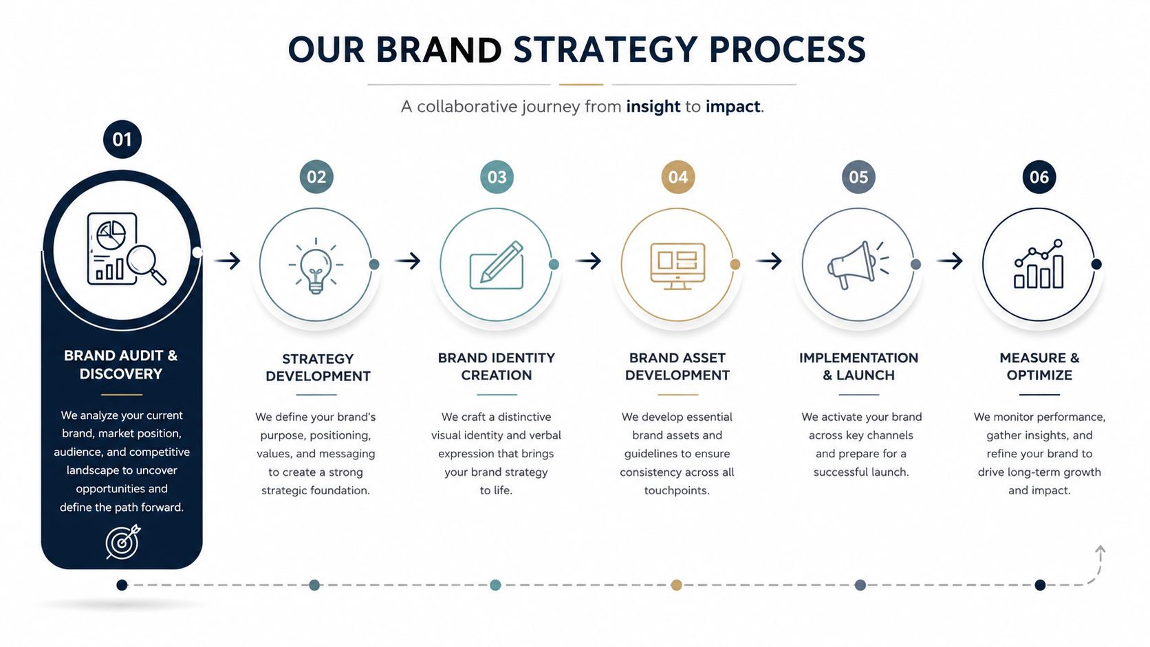
The first real mistake firms make is opening a design tool before they've inventoried what already exists. A proper brand audit starts with the current reality, website pages, email signatures, slide decks, onboarding packets, social assets, print collateral, and any templates teams reuse without much oversight. Magnt recommends spending 2 to 3 weeks reviewing existing brand materials, website and social media, customer touchpoints, competitor branding, and brand perception surveys before defining the standards that will guide the system, with another 1 to 2 weeks for standards and 1 to 2 weeks for documentation, for a total project window of roughly 4 to 8 weeks from audit through documentation and review. Magnt's brand guidelines guide is useful here because it treats the audit as the foundation, not an afterthought.
What the audit should uncover
The audit is not just about finding ugly assets. It's about spotting patterns that should become rules and exceptions that should disappear. A compliance team may find that one channel always uses the long disclaimer while another hides it in a footer, or that advisors are downloading old logos from a shared folder because nobody has clearly marked the approved files.
The audit is where a firm learns whether its brand problems are isolated mistakes or a process problem.
A strong discovery phase turns those observations into decisions. BrandyHQ recommends defining mission, vision, values, and audience before documenting visual systems, because every downstream rule needs a reference point. That means asking direct questions, such as who the brand is meant to reassure, what level of formality the audience expects, and where the firm needs to sound educational versus decisive.
A useful deliverable set from this phase usually includes three items. First, a short brand inventory that lists every major touchpoint and who owns it. Second, a decision memo that states the brand's mission, vision, values, and primary audience segments. Third, a gap list that shows which materials are inconsistent, outdated, or risky enough to retire before the new guidelines go live.
The payoff is simple. Guidelines built from evidence get used, because they reflect how the firm works. Guidelines built from assumptions usually become a polished document nobody trusts, which is a common failure mode in advisory and banking teams that move fast but don't stop to map the full system first.
Building Your Visual Identity System
Visual identity is where many firms overcomplicate the work or underdocument it. The useful version is not artistic theory, it's a set of rules that lets a marketing coordinator, advisor, or compliance reviewer spot the approved version immediately. Bynder's core sections, brand identity, logo, color palette, typography, tone and voice, imagery, and usage guidelines, are a good baseline, and River Editor's emphasis on visual examples and side by side wrong versus right comparisons is especially important for financial brands where precision matters. brand identity design examples can help teams see how those rules look in practice without needing to guess at presentation format.
Logo, color, and type need hard boundaries
Logo rules should cover approved versions, minimum sizes, clear space, black and white use, and restricted treatments. If the mark falls apart when resized or reversed, the guidelines should say so plainly. The same logic applies to color. State the primary palette, any approved supporting colors, and the values needed to reproduce them across channels, then show what breaks the rules, such as low-contrast combinations or extra accent colors that weren't approved.
Typography needs hierarchy, not just font names. Define headline, subhead, body, and caption treatment so teams know exactly which weights and sizes belong where. In financial services, that hierarchy has to support readability on dense materials like reports, disclosures, and presentations, not just on polished landing pages.
| Component | Key Specifications | Compliance Considerations |
|---|---|---|
| Logo | Approved versions, minimum size, clear space, black and white use | Prevents distortion, misuse, and unapproved lockups |
| Color palette | Primary, secondary, and supporting colors, plus exact reproduction values | Keeps materials readable and avoids off-brand variations |
| Typography | Font families, hierarchy, weights, spacing, fallback options | Supports legibility in reports, web pages, and print |
| Imagery | Photography style, illustration style, icon rules | Avoids visuals that feel speculative, casual, or inconsistent |
| Usage examples | Correct and incorrect applications in real scenarios | Helps teams self-check before sending assets to review |
The fastest way to make these rules usable is to show examples of what passes and what fails. Bynder explicitly calls for usage guidelines and examples, and River Editor notes that side by side comparisons are critical because teams apply rules better when they can see the boundary instead of reading a vague sentence about taste. For teams that want to package the system into a practical library, the internal reference on wealth management logos is a useful reminder that logo guidance should solve day-to-day use, not just define an attractive mark.
Compliance habit: if a visual choice could distract from a disclosure, obscure a logo, or weaken legibility, it doesn't belong in the approved system.
Defining Tone, Voice, and Messaging Rules
Visual consistency won't save a brand if the language sounds careless, overpromises, or buries disclosures. In financial services, the messaging layer carries real weight because clients read tone as a proxy for judgment. A calm, precise voice reassures. A casual, salesy, or slippery voice invites review.
Separate the stable voice from the flexible tone
The voice should stay consistent. The tone should change with context. A retirement planning email to existing clients should sound clear and efficient, while educational content for prospects can be warmer and more explanatory, as long as it doesn't drift into hype. That distinction belongs in the guidelines so writers don't improvise their way into inconsistent messaging.
A practical set of rules usually starts with three questions. What does the firm sound like when it teaches? What does it sound like when it reassures? What does it sound like when it asks for action? Once those answers are written down, teams can draft more confidently because the boundaries are clear.
Messaging rules should also cover what not to say. Avoid language that implies guarantees, overstates outcomes, or compresses complex products into slogans that compliance can't defend. In regulated finance, a sentence can be technically well written and still create review problems if it sounds promotional in the wrong context. That's why a strong guide includes examples of acceptable phrasing for educational content, product pages, client communications, and social posts.
Disclaimers and risk language belong here too. The guide should state where disclosures live, how they're formatted, and what wording conventions keep them visible and consistent. When a firm standardizes those patterns, writers spend less time asking whether a footnote or footer treatment is acceptable and more time making sure the message itself is accurate.
Useful test: if a headline sounds fine only after the disclosure is added, the headline probably needs rewriting.
Advisor Momentum's brand guide framework includes logo usage rules, color and typography standards, voice and tone guidance, messaging pillars, and template examples for assets such as bios, presentations, landing pages, and educational content, and it also addresses disclosure and compliance conventions where brand execution overlaps with regulatory review. That approach fits financial firms because the writing system has to support review, not just style.
Creating Asset Templates and Usage Workflows
A good brand guide becomes real when it produces usable assets. Templates are how the rules travel into the day-to-day work of advisors, marketers, and operations staff. Without them, every request becomes a custom job, and every custom job creates a new chance for inconsistency.
Templates should reduce decisions, not add steps
The best templates are narrow and obvious. Social graphics should already carry the right spacing for text. Presentation decks should lock in headline hierarchy, chart styling, and disclaimer placement. Client report templates should make it hard to move text into unsafe zones or swap in an unapproved font. The point is not creative freedom, it's repeatable quality.
This is also where workflow matters. If a team has to ask for the same files repeatedly, the guide isn't serving its users. A centralized Brand Kit makes the approved versions easy to find, and a simple approval path keeps compliance involved before publication instead of after the fact. The closer the template is to the person who needs it, the more likely the standard gets followed.
A useful workflow usually has three layers:
- Approved source files. Keep final logos, icons, and layout templates in one controlled place.
- Editable working templates. Give marketers and advisors the version they use for common outputs.
- Review checkpoints. Route materials through compliance before they go public, especially if they include performance claims, product references, or regulated language.
That structure reduces rework because reviewers are checking against a stable system instead of fixing every file from scratch. It also makes onboarding easier, since new staff don't have to learn the brand by watching old assets circulate through inboxes.
For teams that manage assets through structured systems, configure brand in Webclaw can serve as a technical reference point for organizing brand assets and settings in a centralized workflow. The broader principle is the same across tools and teams, the less scattered the asset library, the fewer mistakes reach the market.
Governance, Review Cycles, and Rollout Strategy
A brand guide that nobody owns will drift. A brand guide that nobody rolls out will sit untouched. Governance is the part that keeps the standards current, especially in firms where marketing, compliance, and leadership all touch the same materials.
Lightweight and comprehensive models solve different problems
A solo advisor or small practice can often manage with a lightweight model. One person owns the guide, one approval path exists, and the review happens on a simple schedule with extra checks after major changes. That model works when the firm's output is limited and the team is small enough to keep decisions visible.
Larger advisory firms and banking departments need more structure. They usually benefit from a named owner, a designated reviewer, and a clearer approval workflow so updates don't get lost between departments. BrandyHQ recommends reviewing guidelines at least once a year and after major events such as a rebrand, product launch, major campaign, or change in positioning, with a clear owner responsible for updates. Canva's recommendation to keep the guide accessible through internal channels or a shared digital document supports the same idea, if people can't find it, they can't use it.
| Model | Best Fit | Strength | Trade-Off |
|---|---|---|---|
| Lightweight governance | Solo advisors, small teams | Fast decisions and low overhead | Can depend too much on one person |
| Comprehensive workflow | Larger advisory and banking teams | Better control and clearer accountability | Requires more coordination |
| Hybrid approach | Growing firms | Easier to scale without rebuilding everything | Needs discipline to avoid confusion |
The rollout matters just as much as the structure. Teams need a short training session, a clear place to find the guide, and a realistic explanation of what changes now. If advisors, assistants, and marketers all understand the new standard at the same time, adoption is smoother and the old habits fade faster.
A guideline earns its place when people can find it, use it, and update it without hunting through old folders.
The most durable systems treat feedback as part of the process. When a template breaks in the actual world, when a disclaimer needs refinement, or when a new channel creates a fresh use case, the owner should capture the issue and update the guide on the next cycle. That keeps the brand system alive instead of frozen.
Advisor Momentum helps financial firms turn brand standards into usable systems, with branding, website, content, and compliance-aware execution built for regulated teams. If the goal is a guide that advisors, marketers, and compliance reviewers will use, visit Advisor Momentum to see how that process can support a cleaner rollout and a more consistent client-facing brand.
