
A wealth management firm often reaches the same point. The website is getting refreshed, business cards feel dated, and the logo still looks like it came from a generic finance template with a bull, a bar chart, or a swoosh that could belong to almost anyone. That's a branding problem, but in financial services it's also a trust problem.
A prospect usually sees the mark before reading the ADV, service model, or planning philosophy. The logo becomes the first signal of whether the firm feels steady, credible, and professionally managed. In a category crowded with recycled symbols of growth and security, the strongest wealth management logos do more than decorate a homepage. They frame expectations.
Beyond the Bull: Crafting a Logo That Builds Trust. In a financial services market saturated with generic symbols of growth and security, a distinctive logo is more than just a graphic. It is a firm's first handshake, a visual promise of stability, expertise, and fiduciary care. This analysis breaks down standout wealth management logos, exploring the strategic thinking behind their design and offering a blueprint for creating a brand identity that resonates with clients and stands up to regulatory scrutiny. Firms refining their visual identity can also borrow useful cues from Domain Drake's branding strategies, especially around consistency and message fit.
Table of Contents
- 1. Vanguard's Wealth Management Logo
- 2. Charles Schwab's Modern Minimalist Logo
- 3. Goldman Sachs' Serif Wordmark Logo
- 4. Merrill Lynch's Dynamic Bull Symbol Logo
- 5. Fidelity's Circular Badge Logo
- 6. Morgan Stanley's Coat of Arms Logo
- 7. Wealth Front's Geometric Icon Logo
- 8. Advisors' Collaborative Network Logo Professional Association Style
- 8-Point Wealth Management Logo Comparison
- From Concept to Compliance Your Logo Design Blueprint
1. Vanguard's Wealth Management Logo
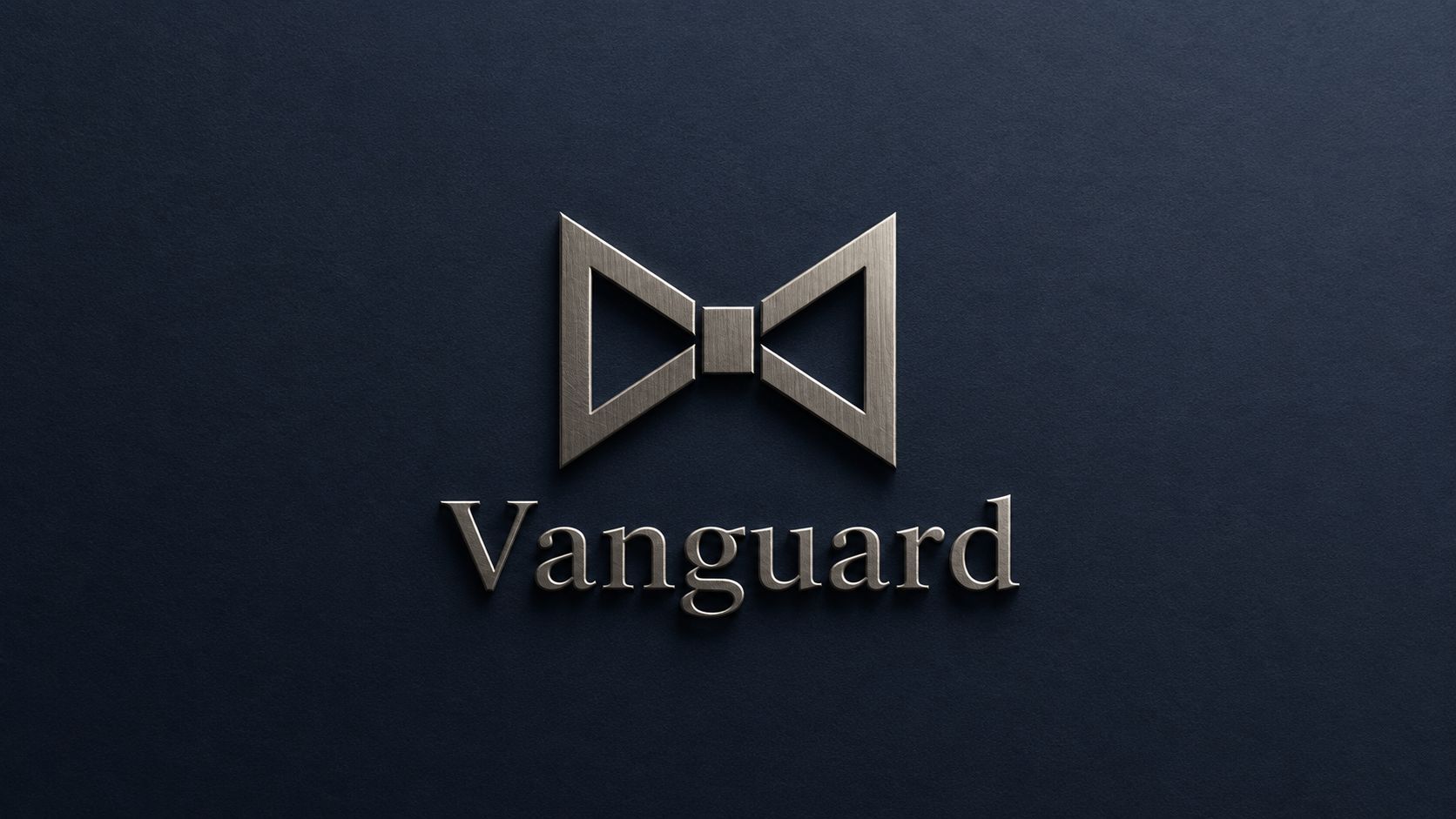
Vanguard's logo works because it doesn't overstate anything. The bowtie-style symbol and serif wordmark communicate control, maturity, and restraint, which is exactly the tone many advisory firms want when clients are evaluating who should help manage long-term wealth.
The strength of this approach is consistency. The mark holds up on website headers, printed advisory statements, onboarding documents, and mobile interfaces because the design isn't dependent on fine detail or trendy effects. In regulated marketing, that matters. Compliance teams need brand elements that are easy to identify and hard to misuse across collateral.
Why it works in a regulated category
The typography does heavy lifting here. A professional serif gives the name institutional weight, while the geometric symbol creates a recognizable shortcut for the brand in smaller placements. That combination is often stronger than using a complex illustration that loses clarity in a client portal or email signature.
For firms building or refreshing a visual system, branding for financial services has to go beyond a single logo file. The logo should connect to stationery, slide decks, proposal templates, social graphics, and review meeting materials without changing personality from one touchpoint to the next.
Practical rule: If a logo only looks good on the homepage hero section, it isn't finished.
A few lessons translate directly from Vanguard's model:
- Use serif type with discipline: Keep the same serif family across formal communications so proposals, letters, and reports feel related.
- Favor balanced geometry: Shapes that suggest symmetry and order usually read better than decorative flourishes in wealth management logos.
- Protect contrast: Strong contrast helps the mark reproduce cleanly on print pieces, PDFs, and digital dashboards.
- Make review easier: Compliance reviewers should be able to identify approved logo versions immediately.
This is a good fit for firms that want to look established without looking stale.
2. Charles Schwab's Modern Minimalist Logo
Charles Schwab shows what happens when a legacy financial brand embraces cleaner, more digital-friendly branding. The simplified mark, paired with modern sans-serif typography, feels more accessible than old-school banking identity systems while still keeping a professional tone.
That balance matters for advisors serving clients who move between desktop dashboards, mobile apps, social media, and video calls. A logo that depends on ornate detail or tiny lines often breaks down in those environments. Schwab's approach avoids that trap by relying on shape, spacing, and legibility.
What digital-first advisors can borrow
The biggest takeaway isn't just “go minimalist.” It's to make sure the logo survives modern usage conditions. On a mobile app icon, social profile image, or email header, the mark has to remain distinct without explanatory text around it.
A practical build process starts with a mark that works at small scale, then expands into a broader identity system. That's where a dedicated financial logo design process becomes useful. Advisors don't just need one polished icon. They need usage rules for dark backgrounds, light backgrounds, avatar crops, sponsorship placements, and co-branded materials.
Short, practical tests reveal whether the design is ready:
- Shrink test: View the mark at favicon size and mobile-nav size.
- Spacing test: Check whether negative space still reads clearly on a compressed screen.
- Color test: Confirm approved colors stay consistent across website, slide, and social uses.
- Avatar test: Make sure the symbol still feels intentional when the wordmark disappears.
Clean logos don't automatically build trust. Consistent application does.
Schwab's style is especially useful for firms courting younger accumulators, tech-forward professionals, or clients who expect a polished digital experience. It proves that wealth management logos don't need to lean on heritage cues to feel credible. They need clarity, restraint, and a system behind them.
3. Goldman Sachs' Serif Wordmark Logo
Goldman Sachs shows what happens when a firm's name, typography, and presentation system do all the work. A serif wordmark can signal heritage, discretion, and institutional credibility without relying on a graphic symbol.
That approach is especially relevant for advisory firms serving affluent families, business owners, and institutional clients. In those segments, a logo does not need to look inventive to feel persuasive. It needs to look established, controlled, and appropriate for high-stakes financial decisions.
When a wordmark is enough
Wordmark-led identities leave very little room for sloppiness. If the kerning is off, the type choice feels generic, or the spacing changes from one application to another, the brand loses authority fast. If those details are handled well, the effect is strong across pitchbooks, custodian-facing materials, office signage, and formal web headers.
This is also one of the safer directions for regulated brands. A serif wordmark rarely creates the interpretive problems that come with aggressive symbols, abstract metaphors, or imagery that suggests speed, certainty, or outsized performance. For many RIAs, that restraint is not just an aesthetic preference. It reduces avoidable compliance questions during review.
A wordmark-first system tends to work best under a few clear conditions:
- The firm name has presence: Short, distinctive, or well-structured names carry more weight on their own.
- The client experience is formal: Traditional typography fits firms built around planning depth, multigenerational relationships, and white-glove service.
- The supporting brand standards are disciplined: Paper stock, proposal templates, website typography, and presentation formatting need to reinforce the same level of care.
- The goal is durability: Classic type treatment usually ages better than trend-driven effects or symbolic shortcuts.
There is a practical trade-off. A full wordmark often loses clarity in tight digital spaces such as social avatars, mobile headers, and small sponsorship placements. Firms that choose this route usually need a secondary mark, often a monogram or initials lockup, so the identity remains usable across every approved application.
For advisors considering a refresh, that is the lesson worth taking from this style. Simplicity works, but only when the brand system around it is equally disciplined. A serif wordmark is less about decoration and more about control.
4. Merrill Lynch's Dynamic Bull Symbol Logo
A prospect sees the bull before they read a word. That matters.
Merrill Lynch's symbol shows how a single visual can carry a brand across advertising, sponsorships, client materials, and digital channels without losing recognition. The mark signals energy and conviction immediately, which is why it has stayed memorable for so long. In branding terms, that is the advantage of a symbol-led identity. It shortens the path to recall.
The trade-off is sharper in wealth management than in other categories. A forceful symbol creates a strong first impression, but it also narrows the emotional range of the brand. If a firm sells steady planning, family governance, tax coordination, and long-term counsel, an aggressive animal mark can send the wrong signal before an advisor ever speaks to the client.
That mismatch creates two practical problems. First, the logo can overpromise the tone of the experience. Second, it can invite extra scrutiny during compliance review if the imagery feels tied to performance, certainty, or market dominance. In my experience, firms run into trouble less from the art itself and more from the gap between the symbol and the story wrapped around it.
Strong symbols work best when they express conviction, not guarantees.
That distinction is why Merrill's bull works better for an established national brand than it does for many independent firms trying to borrow the same formula. Merrill has decades of brand equity behind the image. A smaller advisory firm usually does not. Without that history, the symbol can feel generic, or worse, like a shortcut to borrowed authority.
For advisors evaluating a symbol-led logo, I use four practical checks:
- Positioning fit: Does the image reflect how the firm advises clients?
- Compliance fit: Could a reviewer reasonably question whether the symbol implies results or certainty?
- Distinctiveness fit: Would the mark still feel ownable without the firm name beside it?
- Use-case fit: Does it stay clear in black and white, small digital placements, stitched apparel, and presentation templates?
The lesson here is not to avoid bold symbols. It is to choose them carefully. In regulated marketing, memorability helps only when it is paired with restraint, clarity, and a brand promise the firm can support in every client-facing context.
5. Fidelity's Circular Badge Logo
A circular badge signals order. For a wealth management firm, that can be useful because the shape suggests that planning, investment management, retirement advice, and service all belong to one system instead of separate offerings stitched together over time.
That message matters in regulated marketing. Advisors often need a logo that feels established without sounding grandiose, and a contained mark can do that well. It gives the brand a clear boundary, which tends to read as organized, steady, and complete.
Badge logos also solve a practical problem. They usually adapt better than sprawling wordmarks in mobile navigation, client portals, social profile images, and app-style placements because the shape is already compact.
Where badge logos succeed
The design has to stay disciplined. Once too much type, ornament, or symbolism gets packed into a circle, legibility drops fast. What looks polished on a presentation cover can turn muddy in a website header or compliance footer.
I usually evaluate badge-style logos on compression first. Can the mark still read clearly at small sizes? Can the firm create a reduced version without losing recognition? If the answer is no, the badge is carrying too much detail.
Color choice also does heavy lifting here. Blue remains common in advisory branding because it supports a calm, trustworthy tone, but the bigger issue is contrast and consistency. If the palette cannot hold up in grayscale, low-ink printing, dark mode, and accessibility checks, the logo system is incomplete.
A useful badge identity usually includes:
- Primary badge: Full version for website headers, brochures, and presentation covers.
- Reduced mark: Simplified icon for favicons, portal menus, and profile images.
- One-color version: Clean adaptation for forms, disclosures, and production-limited print uses.
- Clear-space standards: Fixed spacing rules so the mark stays readable and does not feel crowded.
Fidelity's logo style works because the enclosure reinforces a practical brand promise. Everything is meant to feel connected, managed, and contained. For firms offering coordinated advice, that is a stronger visual message than a decorative symbol or an overly abstract mark.
6. Morgan Stanley's Coat of Arms Logo
Heritage marks ask a harder branding question than modern wordmarks do. Can a firm signal permanence and judgment without looking dated, inflated, or overly ceremonial? Morgan Stanley's coat-of-arms style points to one workable answer. The identity draws on tradition, but the effect depends on control, not decoration.
For wealth managers, that distinction matters. A crest or shield can suggest stewardship, family continuity, and institutional discipline. Those associations are useful with high-net-worth households, business owners, and multigenerational clients who want a firm that appears established and careful. The risk is practical. Once the mark becomes too detailed, it stops working in the places advisors need it to work, such as mobile headers, client portals, social profiles, and disclosure-heavy materials.
The strongest heritage logos usually reduce to one clear idea. A shield shape. A monogram. A restrained emblem tied to the firm's history or investment philosophy. If the mark needs ornate linework, banners, or tiny symbolic elements to make sense, it is already too dependent on large-format use.
That is the true strategic test for this style. Tradition has to feel specific to the firm. Generic crests, lions, columns, and laurel wreaths often read like borrowed authority, which is a poor fit for an industry built on trust and substantiation. In regulated marketing, visual claims matter too. If a logo suggests legacy, precision, or institutional depth, the rest of the brand experience has to support that message.
I usually advise firms considering a heritage identity to build a small system, not a single hero mark. That gives marketing teams and compliance teams better control across channels.
Useful guardrails for this style include:
- Start with the core device: Build around one recognizable shape or symbol, not a collection of decorative parts.
- Create formal and simplified versions: Use the full mark for presentations or stationery, and a reduced version for digital placements and small sizes.
- Test in one color early: Fine details often collapse first in black-and-white forms, disclosures, and low-resolution environments.
- Tie symbolism to real positioning: Every element should connect to the firm's story, client base, or philosophy.
- Check tone against audience expectations: Some clients read heraldic design as reassuring. Others see it as distant or old-fashioned.
A coat-of-arms logo will not suit every advisory firm. For practices built around legacy planning, private wealth relationships, or a more formal client experience, it can still be an effective direction. The key is editing hard enough that the mark communicates authority without carrying unnecessary visual weight.
7. Wealth Front's Geometric Icon Logo

A prospect opens your app, skims a dashboard, then sees your logo in the corner of the screen. In that moment, a geometric mark has one job. It needs to feel clear, current, and credible without asking for explanation.
That is why abstract, digital-first logos appeal to robo advisors, hybrid firms, and planning businesses with a strong technology story. Clean geometry signals order and efficiency. It also fits the places where these brands live, such as mobile screens, client portals, social avatars, and presentation templates.
This style works well in wealth management, but it is less forgiving than firms expect. A traditional symbol can borrow meaning from familiar finance cues. An abstract icon has to earn recognition through consistency, proportion, and repeated use across the brand system. If the mark is generic, clients will not remember it. If it is overly clever, compliance teams and internal stakeholders often struggle to apply it consistently.
The strongest geometric logos usually communicate three things at once:
- Precision: Repeated angles, balanced spacing, and disciplined construction suggest a process-driven firm.
- Modern delivery: Flat forms and simplified shapes feel native to digital products and online client experiences.
- Scalability: A good icon still reads at favicon size, inside a mobile app, or in the corner of a PDF with disclosures.
Color choices matter here too. Financial firms often rely on blue because it supports a sense of stability and professionalism. A secondary accent can keep the brand from feeling cold or overly technical. The trade-off is practical. Add too much contrast or too many colors, and the logo starts to look more like software branding than wealth management branding.
I usually advise firms considering a geometric direction to test the logo less like a print asset and more like a product asset. Put it on a login screen. Shrink it to app-icon size. Drop it into a chart header, a proposal cover, and a compliance-approved email signature. That process reveals weaknesses fast.
A geometric logo is a strong fit for firms positioned around automation, transparency, and modern planning tools. It performs best when the icon is simple, the typography is disciplined, and the surrounding brand system does enough work to turn an abstract shape into a recognizable financial brand.
8. Advisors' Collaborative Network Logo Professional Association Style
Not every logo in wealth management is the firm's primary brand. Advisors also use network marks, certification logos, and association badges to reinforce credibility. Interlocking circles, connected nodes, and collaborative motifs often appear in these marks because they signal membership, standards, and professional community.
That can help an independent firm look more established, especially when clients value designations and affiliations. But these logos need careful handling. If the association mark competes with the firm logo, the page starts to look crowded and the primary brand loses clarity.
Using network marks without confusing the primary brand
Association-style marks work best as supporting proof points. On advisor bio pages, proposal footers, credential sections, and conference materials, they can add legitimacy without overwhelming the main identity. Placement and hierarchy matter more than decoration.
There's also a practical branding point here. In wealth management, niche positioning often outperforms broad positioning. Alden Investment Group's advisor branding article notes that 70% of top financial advisors earning $1 million or more operate within a clearly defined niche, which makes visual differentiation more important, not less. Association marks can support that positioning, but they can't replace a distinct firm logo.
A clean approach usually follows a few rules:
- Lead with the firm mark: The advisory brand should always remain primary.
- Set size rules: Certification and membership marks need fixed dimensions and spacing.
- Disclose relationships clearly: Don't leave room for clients to misunderstand affiliations.
- Use templates: Approved slide, proposal, and web layouts reduce misuse.
Professional association logos are most valuable when they reinforce a clear brand, not when they try to stand in for one.
8-Point Wealth Management Logo Comparison
| Logo / Style | ???? Implementation complexity | ⚡ Resource requirements | ⭐ Expected outcomes | ???? Ideal use cases | ???? Key tips |
|---|---|---|---|---|---|
| Vanguard's Wealth Management Logo | Low, minimalist geometric mark; precision required | Low–moderate, typography, brand system, print/digital specs | High credibility, stability, and scalability | Institutional wealth management, official documents, broad-brand recognition | Maintain consistent serif typography; strong contrast; precise geometry |
| Charles Schwab's Modern Minimalist Logo | Low–moderate, simple mark with flexible configurations | Moderate, responsive digital variants and legibility testing | Strong digital engagement and contemporary appeal | Mobile/web-first platforms, advertising to younger/tech-savvy investors | Test small-size legibility; define color and spacing rules |
| Goldman Sachs' Serif Wordmark Logo | Low, wordmark-focused but needs typographic refinement | Low–moderate, premium materials, careful kerning for print & web | High perceived heritage, authority, and premium positioning | HNWI/institutional communications, executive materials, formal collateral | Use generous whitespace; optimize serif for screens; premium finishes |
| Merrill Lynch's Dynamic Bull Symbol Logo | Moderate, symbol dynamics require sizing rules and alignment | Moderate, symbol art, color guidelines, adaptable layouts | Very distinctive; conveys optimism, strength, and performance | Performance-oriented marketing, large-scale campaigns, recognizable signage | Test symbol standalone; ensure contrast and scalable versions |
| Fidelity's Circular Badge Logo | Moderate, contained badge needs careful internal spacing | Moderate, icon/versioning for apps, favicons, and print | Signals comprehensive, integrated service offering; versatile | Integrated service platforms, app icons, client statements | Ensure internal spacing; create simplified icon for small sizes |
| Morgan Stanley's Coat of Arms Logo | High, ornamental details demand careful simplification | High, specialist illustration, multiple color/monochrome versions | Strong legacy, protection, and premium trust signals | Executive collateral, institutional trust-building, premium branding | Provide simplified digital marks; limit ornamentation for clarity |
| WealthFront's Geometric Icon Logo | Low, clean flat geometry and straightforward system | Low, digital-first assets, responsive icons, color variants | Positions as tech-forward; excellent digital legibility | Fintech apps, robo-advisors, social profiles and digital marketing | Pair with modern sans-serif; optimize for mobile/responsive sizes |
| Advisors' Collaborative Network Logo | Moderate, system for member customization and badges | Moderate–high, templates, compliance guidance, certification marks | Builds network credibility and signals professional affiliation | Professional associations, member badges, co-branded materials | Clarify usage rules; include compliance-ready templates and disclosures |
From Concept to Compliance Your Logo Design Blueprint
The best wealth management logos don't win because they're trendy. They win because they fit the business model, the client audience, and the regulatory environment. A logo for a multigenerational planning firm should not feel interchangeable with one for a digital-first investing platform. The strongest marks make that distinction visible right away.
Several patterns show up across the examples above. Simplicity tends to age better than novelty. Typography matters more than many firms expect. Symbolism can help, but only if it reflects the advisory philosophy instead of copying category clichés. Color choices carry strategic weight because prospects make quick trust judgments from visual cues long before they evaluate planning depth or service structure.
Compliance should enter the process early, not after the logo is done. In wealth management, visual branding doesn't live in isolation. It appears on websites, social graphics, pitch books, statements, presentations, videos, email signatures, and recruiting materials. If the mark is hard to reproduce, easy to misuse, or suggestive of exaggerated outcomes, the design problem quickly becomes an operational problem.
A practical design brief should answer a few hard questions before any concepts are drafted:
- Who is the target client: Retirees, business owners, executives, physicians, multigenerational families, or another niche.
- What should the brand signal: Stability, innovation, personal guidance, institutional depth, or collaborative expertise.
- Where will the logo live most often: Website navigation, mobile screens, PDFs, social avatars, signage, or formal print collateral.
- What must compliance review flag early: Symbolism, implied claims, color consistency, and approved use cases.
That preparation saves time. It also leads to better design decisions because the firm isn't choosing a logo based only on personal taste. It is choosing a visual system that can support growth.
When a firm reaches the point of execution, specialist support matters. A branding partner that understands advisory marketing workflows can connect logo development to the larger system of website design, content, lead generation, and review processes. That's the difference between a logo that looks good in a presentation and one that keeps working in everyday operations.
There's also a legal layer to protect. Before finalizing a name and mark, firms should understand ownership and protection basics, including learn about IP for new businesses. That step is easy to delay and expensive to revisit later.
For firms ready to refresh their identity, the right path is clear. Define the positioning. Clarify the niche. Build for real-world applications. Pressure-test every concept for legibility, consistency, and compliance fit. Then launch with guidelines strong enough to keep the brand coherent across every client touchpoint. A specialist like Advisor Momentum can help turn that process into a branding system that's visually credible, strategically aligned, and review-ready from day one.
Advisor Momentum helps financial advisors, RIAs, wealth managers, and banking teams build brands that look credible and hold up under compliance review. From logo design and brand strategy to compliant websites, content, recruiting, and growth support, Advisor Momentum gives regulated firms a partner that understands both marketing performance and the realities of financial services oversight.
