
A retired couple searches for a financial advisor, opens a homepage, and sees a polished banner, vague language, and no obvious way to verify who's behind the firm. They don't study the navigation. They don't read every service description. They decide whether the site feels credible enough to deserve another minute.
That moment captures the job of financial advisor website design. The site must make expertise visible, reduce uncertainty, explain the relationship clearly, and guide the visitor toward one sensible next step. A larger budget can't rescue a confusing message or a buried disclosure. Deliberate choices can.
Table of Contents
- Why Most Advisor Websites Lose Cautious Prospects in the First Five Seconds
- Setting Conversion Benchmarks and Picking the Right Page Architecture
- Building the Brand, Information Architecture, and UX That Earns Trust
- Compliance and Accessibility Checkpoints Before Anything Goes Live
- The Removal-First Content Strategy That Converts Better
- Technical SEO, Analytics, and CRM Integration Foundations
- Launch Week Checklist and Post-Launch Troubleshooting
Why Most Advisor Websites Lose Cautious Prospects in the First Five Seconds
The trust gap often appears before a prospect reads a full sentence. A missing advisor photograph, generic value proposition, stock image of a handshake, or legal information hidden in the footer can suggest distance and evasion. Cautious investors and plan sponsors have already encountered enough interchangeable advisor sites to recognize those patterns quickly.
The website has become a central credibility tool because trust in financial services remains fragile relative to the responsibility advisors carry. Edelman's 2024 Financial Services supplemental report found that 62% of respondents trusted financial services companies to do the right thing, enough to place the sector in the “trusted” category for the first time since 2012. The same report also points to the importance of a firm's owned website, with 68% calling the brand's own website important or very important in decision-making, compared with 61% for consumer ratings and reviews. Edelman's financial services trust findings provide useful context for why a website has to function as proof, not decoration.
Close the gap in the right order
A prospect's first scan should answer four questions:
- Who is this firm? Show a real advisor or team, professional credentials, and a clear description of the people served.
- What problem does it solve? Replace broad phrases such as “wealth solutions” with plain language tied to a recognizable situation.
- Why should the visitor believe it? Place process details, relevant experience, fee information, disclosures, and carefully reviewed proof near the claims they support.
- What happens next? Offer one primary action, such as booking an introductory call or requesting a conversation.
Digital advice already plays a meaningful role in the discovery process, although it doesn't automatically carry the credibility of a professional relationship. A Federal Reserve Bank of Philadelphia study found that 23.7% of respondents had referred to a financial website for advice, making websites the second most common source in that survey. Financial advisers had a net trust rating of 33.7%, while finance websites had a net trust rating of -9.1%, illustrating why the site must transfer confidence to the advisor rather than ask the content to stand alone. The Philadelphia Fed study on trust and credibility makes that distinction clear.
Practical rule: The first screen should communicate identity, relevance, and a safe next step without requiring the visitor to decode the firm's vocabulary.
Advisors evaluating acquisition channels can also use this overview of best lead strategies for advisers as a broader planning resource. The website should support those strategies with a focused destination, not force every campaign to send prospects to the same generic homepage.
Setting Conversion Benchmarks and Picking the Right Page Architecture
A homepage shouldn't be judged by the same standard as a focused campaign page. Industry benchmarks commonly place brochure-style advisor websites around 0.5% to 1.5% visitor-to-lead conversion, while conversion-focused sites with a defined niche, reduced navigation friction, and one primary call to action often reach 3% to 8%. Those ranges come from financial advisor website conversion benchmarks, and they should be treated as directional rather than guaranteed outcomes.
Landing pages show a similarly wide spread. Advisory and wealth-management landing pages are often cited around 3.4% to 4.0% average conversion, with top performers reaching 11.5%. Paid financial-services landing pages are commonly reported in the 3% to 8% range, with some single-service paid offers extending to 6% to 14%. Wealth-management landing page benchmark data also emphasizes that form length, niche relevance, CTA concentration, and trust architecture affect the result.
Choose the page for the visitor's intent
A broad homepage works when the firm has one dominant audience and a simple offer. It should lead with one action, keep secondary links visually quiet, and use the body of the page to answer the questions that prevent a prospect from booking.
A dedicated landing page usually performs better when the visitor arrives from a specific search, referral, or advertisement. A person looking for retirement planning within five years of leaving work should see that phrase reflected in the headline, supporting proof, form language, and confirmation experience. A referral page can use the referring partner's context, while a paid page should avoid navigation that distracts from the promised action.
| Architecture | Avg. Visitor-to-Meeting Rate | SEO Reach | Build Effort | Best Use Case |
|---|---|---|---|---|
| Broad homepage | 0.5% to 1.5% visitor-to-lead benchmark | Broad firm and local intent | Lower | One primary audience and offer |
| Niche landing page | 3% to 8% benchmark for focused conversion sites | Narrow, high-intent queries | Moderate | Search or campaign traffic tied to one need |
| Paid single-service page | 3% to 8%, with some benchmarks at 6% to 14% | Limited organic role | Moderate | A defined paid offer and one conversion action |
| Referral landing page | No separate verified rate | Referral-specific relevance | Moderate | Partner or professional referral traffic |
The operating metric shouldn't be visits alone. Review booked meetings, qualified pipeline, and downstream client rate, because audience fit and action type can change the meaning of a conversion.
Building the Brand, Information Architecture, and UX That Earns Trust
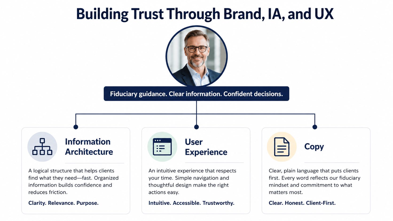
Brand, information architecture, user experience, and copy shouldn't be handed off as unrelated deliverables. A restrained color palette can support readability, but only if the copy explains who the firm helps. A compelling promise can attract attention, but only if navigation helps the visitor verify it.
Start with the visible fundamentals:
- Use a real advisor photograph: A current, professional headshot gives the visitor a person to evaluate.
- Write a plain-language tagline: “Retirement planning for physicians approaching a career transition” communicates more than a broad promise about financial confidence.
- Keep the visual system restrained: Deep neutrals, generous spacing, and consistent typography usually support seriousness better than decorative motion.
- Choose readable type: A serif or humanist sans can work, provided the size, spacing, and contrast remain comfortable on desktop and mobile.
Organize around prospect questions
Internal service labels often reflect the firm's structure, not the visitor's concern. A flat menu with About, Services, Insights, and Contact gives a prospect a predictable path. Within Services, pages can describe situations and outcomes in language the target audience uses.
The homepage should follow a deliberate sequence:
- Hero promise and CTA: State who the firm serves, what it helps with, and how to start.
- Proof bar: Present appropriate credentials, affiliations, or other reviewable trust signals.
- Advisor bio block: Put the person behind the promise near the top, not several clicks away.
- Process overview: Explain what happens before, during, and after the introductory conversation.
- Niche-specific offers: Direct different visitor types to relevant service pages.
- Frequently asked questions: Address fees, fit, timing, and engagement expectations.
- Disclosures: Make required information findable without turning it into an unreadable wall of legal text.
A sticky CTA can keep the next step available during a long mobile scroll, but it shouldn't cover content or consent controls. Forms should request only information needed to begin the conversation. Trust badges belong near the form they support, while accessible contrast and clear labels help the visitor understand what action is being taken.
A trustworthy interface doesn't make a prospect work to confirm basic facts.
Compliance and Accessibility Checkpoints Before Anything Goes Live
Compliance belongs inside the page design process, not at the end of it. Under the SEC's Marketing Rule, effective November 4, 2022, testimonials and endorsements can appear in adviser advertising only when the adviser satisfies disclosure, oversight, and disqualification conditions. The advertisement must clearly and prominently state whether the promoter is a client and whether the promoter is compensated. Written agreements are generally required unless an affiliate is used or compensation is de minimis, which the SEC defines as $1,000 or less in the prior 12 months. The SEC's final Marketing Rule release should sit inside the firm's review reference library.
The practical impact is visible in specific components:
- Testimonials and endorsements: Place required disclosures beside the relevant content, not in a distant legal page.
- Performance content: Review presentation, context, time periods, and required qualifications before publication.
- Hyperlinks: Keep adjacent disclosures visible when a link could create an impression the surrounding copy doesn't support.
- Ratings and awards: If used in advertising, identify the rating date, rating period, provider, and whether the adviser paid for the rating or its use in advertising, as outlined in this SEC Marketing Rule compliance guide.
- Reviews and social proof: Treat website reviews as advertising content that requires review, not as automatically exempt commentary. The SEC guidance on testimonials and social media explains why misleading use and rule restrictions matter.
Run one coordinated checkpoint
State requirements may add another layer, including state-specific disclosures in California, New York, New Jersey, and other jurisdictions where applicable. Form CRS should be hosted and linked prominently, while ADV Part 2A delivery points should align with the firm's actual process. The internal compliance page on SEC compliance for financial firms can help teams frame those review questions.
Accessibility supports the same trust outcome. WCAG 2.1 AA is a practical target in major markets, with measurable contrast requirements of at least 4.5:1 for normal text and 3:1 for large text. A guide to accessibility compliance can help teams broaden the review beyond color selection.
The pre-launch workflow should assign ownership:
- Compliance officer: Approves claims, disclosures, placement, testimonials, and performance language.
- Designer and developer: Test keyboard access, focus states, labels, alt text, contrast, responsive layouts, and assistive technology behavior.
- Marketer: Verifies structured data, Form CRS visibility, analytics events, and search presentation.
- Firm owner: Confirms that the live experience matches the approved version.

The Removal-First Content Strategy That Converts Better
Most advisor websites don't suffer from a lack of content. They suffer from too many pages competing for attention. Detailed navigation can feel like evidence of expertise to the firm, while a prospect experiences it as a series of decisions with no obvious destination.
A removal-first audit starts with subtraction:
- Duplicate About pages: Keep one authoritative page that explains the people, credentials, approach, and fit.
- Fragmented service pages: Consolidate six overlapping descriptions into one clear core offering when the audience and decision are the same.
- Stock-photo team galleries: Replace generic images with relevant people, real office context, or no image at all.
- Low-intent blog posts: Remove or redirect articles that attract visits but don't answer a prospect question or support a service page.
The replacement architecture should make one next step unmistakable, usually an introductory call. Supporting pages can target situations prospects search for, such as a recent divorce, retirement within five years, or a sudden liquidity event. Each page needs a distinct promise and a reason to contact the firm, not a rewritten version of the same general biography.
Keep authority assets selective
A lean site can still demonstrate competence. One fee explainer can answer a high-friction question. A market commentary archive can show how the firm communicates. A quarterly letter can create a durable authority asset without forcing the team into a content treadmill.

The decision rule is simple: if a page doesn't build trust or support conversion, it's decoration competing with the next step. A content audit should label every URL as retain, consolidate, redirect, improve, or remove. That process protects search equity while making the visitor's route shorter and more comprehensible.
Technical SEO, Analytics, and CRM Integration Foundations
A designer's decisions become valuable only when developers can implement and measure them consistently. Each page type needs a title-tag and meta-description pattern, with language tied to the audience and service rather than a generic firm slogan. City variants should use canonical tags where appropriate, and related blog posts should link back to the service pages they support.
Performance requires explicit acceptance criteria. The following Core Web Vitals targets provide a useful technical baseline:
| Metric | Target | Why It Matters |
|---|---|---|
| Largest Contentful Paint | Under 2.5 seconds | Helps the main promise appear quickly |
| Interaction to Next Paint | Under 200 milliseconds | Keeps buttons, menus, and forms responsive |
| Cumulative Layout Shift | Under 0.1 | Prevents content from moving while a visitor reads or clicks |
Image compression, modern image formats, stable dimensions, and restrained animation support those targets. The implementation team should test actual templates, not only a staging homepage.
Make the site machine-readable
Use structured data that matches visible content:
- FinancialService and FinancialAdvisor: Describe the firm and advisory function.
- Person: Connect each advisor to the firm and relevant profile.
- FAQPage: Support genuine fee and service questions.
- BreadcrumbList: Clarify page hierarchy across the site.
Search Console verification should happen before launch. Analytics should use a server-side or proxy approach where needed so personally identifiable information doesn't enter URLs. Call tracking must send events into the CRM rather than a separate inbox, and forms should route into a tagged pipeline stage with ownership assigned.
Measurement standard: A lead isn't the finish line. The useful chain is landing page, inquiry, booked meeting, qualified pipeline, and acquisition cost.
Teams building visibility across conversational search can consult these ChatGPT brand visibility tips, while the SEO roadmap strategy for advisors offers a framework for organizing technical, content, and authority work. Advisor Momentum can also provide compliance-ready website design and development for financial advisors, alongside related digital marketing and content services.
Launch Week Checklist and Post-Launch Troubleshooting
Launch quality depends on named owners and scheduled checks. A site can look correct in a browser while sending forms to the wrong pipeline, exposing an outdated disclosure, or leaving important pages unindexed.
Use a dated launch sequence
- Day minus 7, SEO owner: Complete the redirect map, crawl the old site, resolve obvious 404s, and confirm that priority URLs have destinations.
- Day minus 3, QA owner: Run cross-browser, mobile, keyboard, and assistive-technology smoke tests. Submit every form with test data.
- Day 0, technical owner: Move the approved build from staging to production, confirm SSL behavior, and check that canonical tags and robots directives match the launch plan.
- Day plus 2, analytics owner: Validate Search Console access, GA4 events, call events, thank-you pages, and CRM pipeline tags.
- Day plus 7, operations owner: Call each CRM owner and confirm that inquiries arrive with the right attribution, consent information, and follow-up assignment.
The review cadence should stay operational. At day 30, compare traffic, form-fill activity, and booked-meeting conversion with the benchmarks established for the selected architecture. At day 45, inspect heatmaps and scroll depth to identify where visitors stop reading or miss the CTA. At day 90, run a full content prune using the removal-first standard.
Troubleshoot by isolating the change
| Failure | Likely Cause | Owner and Next Step |
|---|---|---|
| Bounce rate spikes after a hero swap | New promise doesn't match search intent, or the page became slower | Marketing owner compares the old and new message, then technical owner checks performance |
| Form conversions fall after a CRM webhook change | Submission succeeds visually but routing or confirmation fails | CRM owner tests the full path, restores the last reliable connection, and logs the defect |
| Index bloat appears from advisor bio pages | Orphaned, duplicate, or thin profile URLs remain discoverable | SEO owner inventories those URLs, assigns canonical or redirect actions, and requests reprocessing |
A launch isn't complete when the DNS cutover ends. It's complete when a cautious prospect can understand the firm, verify its legitimacy, complete the next step accessibly, and enter a compliant follow-up process without the team guessing what happened.
Advisor Momentum helps financial advisors and banking teams build compliance-ready websites, focused content programs, branding systems, and lead-generation campaigns around real prospect intent. Visit Advisor Momentum to discuss a website architecture that makes trust, accessibility, compliance, and conversion work together.
