

An advisor has likely been in this position. The firm invested in a polished website, approved the copy, launched the pages, and then watched the same problems continue. Leads stayed weak. Compliance flagged language late. Basic updates turned into slow, expensive revisions because nobody defined the rules up front.
That's the primary challenge in web design financial firms face. The site has to persuade a skeptical prospect, satisfy a regulator, support internal workflows, and still feel simple to use. If compliance only appears at the end, the project usually breaks in the same places. Claims get rewritten. layouts get reworked. Forms need new consent language. Tracking has to be reconsidered after launch.
The firms that handle this well build compliance into every stage. They treat disclosure design, consent handling, accessibility, content structure, and archival requirements as part of the product, not as cleanup work. That approach creates a better website and a safer one.
Table of Contents
- The Unique Challenge of Financial Web Design
- The Foundation Strategy and Compliance Discovery
- Designing for Trust with UX and Content
- The Technical Build for Performance and Security
- Optimizing for Discovery with SEO AEO and GEO
- The Compliance First Launch Process and Checklist
- Beyond Launch Analytics and Continuous Improvement
The Unique Challenge of Financial Web Design
A financial website can't behave like a generic professional services site. Prospects don't arrive ready to believe. They arrive cautious, comparison-minded, and alert to anything that feels vague, overpromising, or hidden.
That is why financial services treats the website as the primary trust gate where prospects decide credibility. Design quality directly influences whether an advisor or wealth manager converts a lead, and the broader market reflects how much regulated industries are investing in this area, with the web design market projected to reach $92.06 billion by 2030 according to Figma's web design statistics resource.
A weak financial website usually doesn't fail because it looks dated. It fails because it asks for trust before it has earned it.
The tension is straightforward. Marketing wants clarity, momentum, and a path to conversion. Compliance wants balance, documentation, and visible controls. Prospects want reassurance without friction. A site that leans too hard in one direction usually underperforms in the others.
A brochure approach doesn't work well here. Generic headlines, stock reassurance, and buried legal language create hesitation. So does a site that feels legally overbuilt and hard to scan. Financial buyers read that friction as risk, not caution.
A stronger model treats every page as both a conversion surface and a supervised communication. That means the homepage, service pages, forms, disclosures, calculators, and analytics setup all need the same discipline.
A practical web design financial strategy does four things at once:
- Builds immediate credibility through clear positioning, visible trust signals, and professional presentation
- Guides action with a simple path toward a consultation, contact request, or next step
- Reduces review friction by designing around regulatory requirements from the first draft
- Creates operational stability so updates, approvals, and audits don't become fire drills
That shift changes the whole project. Compliance stops being the team that says no at the end. It becomes part of the architecture that helps the site convert.
The Foundation Strategy and Compliance Discovery
The first mistake most firms make is starting with visual references. They discuss colors, examples, and homepage styles before they've decided what claims they can support, what client segments they want, and what review rules govern the project.
Why the usual brief fails
A standard web brief asks for brand adjectives, a few competitor examples, and a rough sitemap. That isn't enough for a regulated firm. Financial websites need a discovery process that sets business strategy and compliance boundaries at the same time.
A useful project starts by identifying who the firm wants to attract and who it shouldn't attract. A retirement-focused advisor serving pre-retirees needs different messaging, disclosure placement, service explanations, and contact flows than a firm focused on business owners or high net worth families. If that distinction stays fuzzy, the site ends up vague.
This visual captures the groundwork that should happen before design starts.
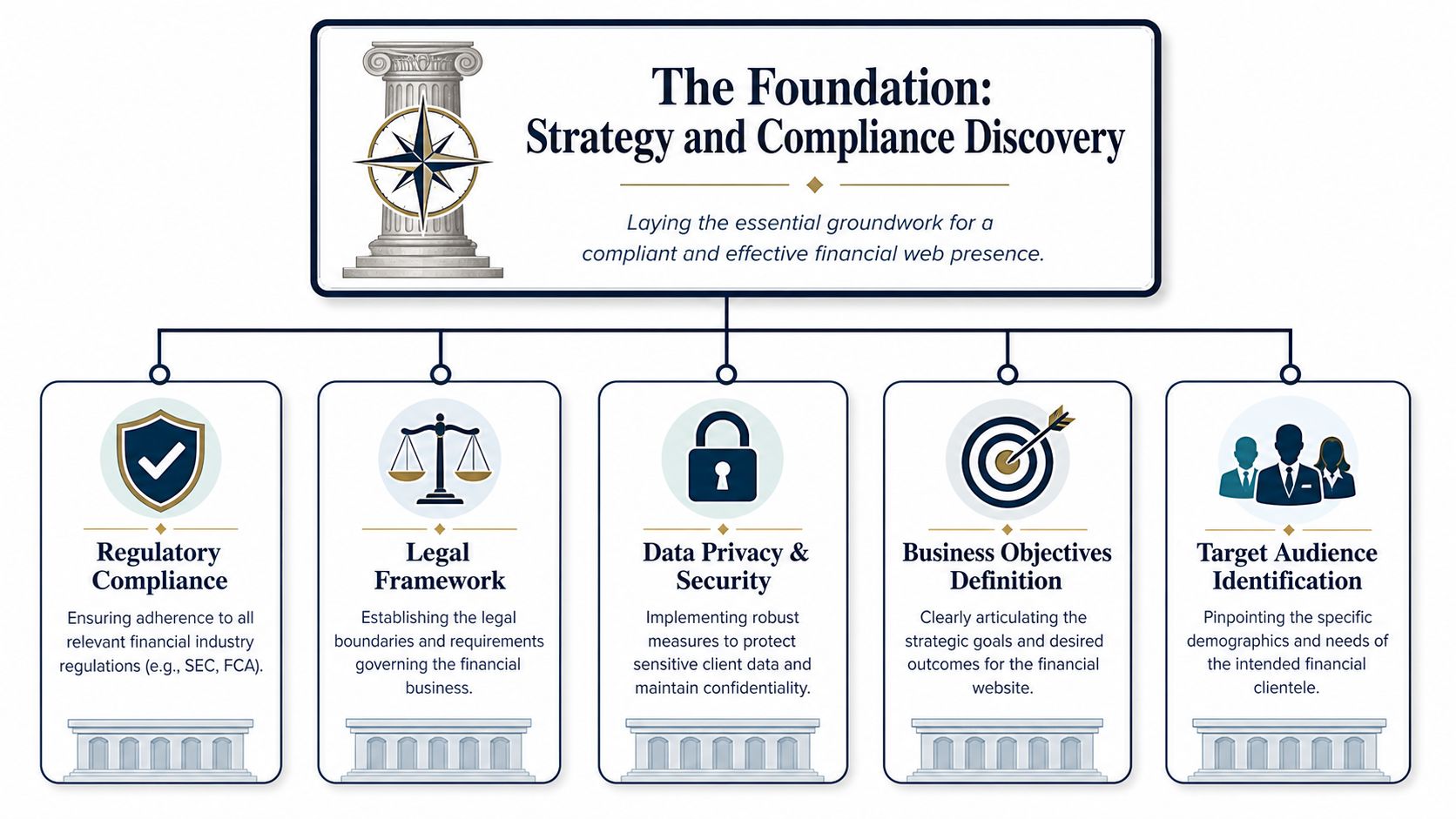
The compliance side has to be defined just as early. Under SEC Rule 206(4)-1, financial advisor websites can't include performance results that aren't fair and balanced, and they can't present gross performance without also displaying net performance with at least equal prominence. That rule has to shape both content and design from the beginning, not after layouts are approved, as outlined in this SEC-focused website compliance overview.
Practical rule: If a claim might require qualification, the design team should know that before wireframes begin.
The questions that shape the build
The strongest discovery sessions produce decisions, not just notes. They answer specific questions that later become design constraints.
A useful framework looks like this:
- Who is the firm trying to reach
Define the audience by life stage, complexity, and expected concerns. Are visitors worried about retirement income, concentrated stock, tax exposure, succession planning, or institutional credibility? Different concerns require different content hierarchy.
- What should a prospect believe after one visit
The site doesn't need to say everything. It needs to land a few essential messages clearly. Usually that includes who the firm serves, how the relationship works, and why the visitor should trust the next step.
- Which claims create review risk
Testimonials, performance references, superlative statements, and unsupported comparisons often create friction. The team should identify these issues before copywriting starts so messaging stays strong without wandering into avoidable edits.
- What happens when someone converts
Many firms design lead capture in isolation. They forget that the handoff matters. Intake questions, CRM routing, consent language, calendar workflows, and response expectations should all be defined in discovery.
- Who approves what
If marketing drafts, compliance revises, and leadership signs off, that workflow should be scheduled into the project. It shouldn't rely on informal review after the build is nearly complete.
A short planning table helps keep those decisions visible:
| Discovery area | What needs to be decided | Why it matters |
|---|---|---|
| Audience | Primary client type and concerns | Controls message, page structure, and calls to action |
| Services | What the firm does and doesn't emphasize | Prevents broad, generic positioning |
| Compliance | Claim boundaries, disclosure needs, approvals | Reduces rewrites and launch delays |
| Data handling | Form fields, consent language, storage expectations | Aligns user experience with privacy obligations |
| Measurement | What counts as a qualified lead | Keeps analytics tied to business goals |
The best financial websites look calm and clear on the surface because the hard decisions were made early. That's the core value of discovery. It saves the project from expensive ambiguity later.
Designing for Trust with UX and Content
The visual layer matters, but trust on a financial website comes from the combination of layout, wording, pacing, and disclosure handling. A site can be attractive and still feel unreliable if it buries critical information, overwhelms the visitor, or forces people to guess what happens next.
Trust starts in the layout

A qualified prospect usually wants answers to a short list of questions. Who is this firm for. What does it do. Can it be trusted. What is the next step. A strong page structure answers those questions in that order.
That usually means the homepage shouldn't open with abstract mission language. It should open with a specific audience signal, a plain statement of the firm's service focus, and a visible action path. The action doesn't always need to be "book now." In many cases, "schedule a consultation," "talk with an advisor," or "request a conversation" is better because it matches the decision stage.
Navigation should also reflect how financial prospects think, not how firms organize internally. Visitors don't usually care about internal departments. They care about needs, problems, and fit. Clean top-level choices, restrained menus, and obvious contact paths reduce hesitation.
A practical homepage flow often looks like this:
- Immediate positioning that identifies the audience and service specialty
- Credibility block with registrations, affiliations, or security cues where appropriate
- Service explanation written in plain language instead of industry shorthand
- Process preview that shows what working together looks like
- Low friction conversion path with a contact or consultation option
- Supportive disclosure design near relevant claims, not detached from them
For firms refining their broader visual identity before rebuilding the site, this guide to branding for financial services is a useful companion because messaging and brand structure usually need alignment before UX can perform well.
Disclosures should support the claim
Many firms still treat legal language as something to hide. That approach backfires. Data shows 78% of prospective clients abandon sites where compliance language feels obstructive or invisible, and the stronger approach is to place disclosures immediately next to the claim they qualify using icons and accordions, according to this financial services web design guidance.
That single decision changes user experience dramatically. A claim about a planning process, investment philosophy, or results-related concept feels more trustworthy when the qualification is visible, concise, and easy to expand. Visitors read that as transparency.
If the page makes a claim in large type and hides the qualification in small type, the design is signaling caution for the wrong reason.
Some practical examples work well:
- Adjacent icons for short qualifying notes beside a statement that needs context
- Expandable accordions for fuller legal language that shouldn't dominate the page visually
- Plain language summaries before formal disclosure text so the visitor understands the point quickly
- Consistent styling so disclosures look intentional, not pasted on during review
What doesn't work is dropping everything into a footer or forcing long disclaimer blocks between every paragraph. That interrupts reading flow without building confidence.
Content choices that help qualified prospects act
Financial copy performs best when it is specific, balanced, and easy to scan. Empty phrases like "customized solutions" or "excellence" rarely move a prospect forward. Clear content does.
A better content model uses short sections, descriptive headings, and language that maps to real decisions. Instead of saying the firm "optimizes wealth outcomes," a page can explain who it helps, what planning areas it covers, and what a first meeting includes. That reduces ambiguity.
A concise comparison shows the difference:
| Weak approach | Stronger approach |
|---|---|
| Broad promise with no context | Specific service explanation tied to audience needs |
| Long unbroken paragraphs | Modular sections with headings and scannable proof points |
| Disclosures hidden below the fold | Disclosures placed beside relevant claims |
| Generic imagery and vague CTA | Relevant visuals and a clear next step |
Content and UX also need pacing. Not every visitor will convert on the first session. Some will read an about page, then a service page, then a resource. Others will go straight to the contact page but stall if they don't understand what happens after submitting the form. Good design supports both behaviors.
That is why web design financial projects should be planned around visitor confidence, not just visual polish. The site needs to feel readable, balanced, and predictable. In financial services, those are conversion features.
The Technical Build for Performance and Security
The code underneath the design does more than keep the site running. It tells visitors whether the firm takes protection, accessibility, and reliability seriously. In financial services, technical quality isn't invisible. Prospects notice its effects immediately.
Security is part of the message
This infographic captures the core infrastructure priorities behind a trustworthy build.
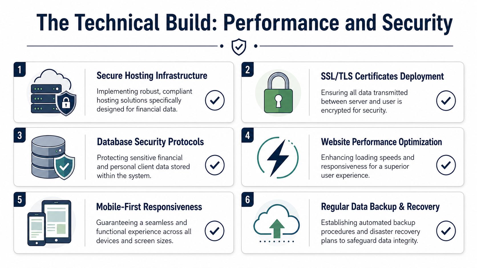
A financial website should display security cues with intention, not treat them as backend details. High-converting financial websites need explicit trust signals such as 256-bit SSL encryption badges, certification logos where applicable, and compliance-minded accessibility standards including WCAG 2.2 AA, as outlined in this financial web design resource.
Those signals matter because users are evaluating risk before they ever submit a form. If contact pages, intake flows, or document request pages feel casual about security, the brand loses credibility fast.
That concern isn't theoretical. For firms that want a practical reminder of how exposed large institutions can be when web security breaks down, the insights into the Amex breach from InsecureWeb are worth reviewing. The lesson isn't about brand size. It's about how quickly user trust can erode when web systems fail.
Accessibility and performance affect trust
A financial site also has to work well for every user who reaches it. Accessibility isn't a nice addition after launch. It affects usability, legal exposure, and how the firm is perceived.
A compliant build should include:
- Keyboard friendly navigation so users can move through menus, forms, and controls without relying on a mouse
- Clear focus states and readable contrast so interactive elements remain visible
- Legible type and stable layouts that reduce confusion for older users and screen reader users
- Consent aware integrations so analytics and CRM connections respect privacy expectations
Performance matters for the same reason. If a page loads awkwardly, jumps while rendering, or delays form interaction, visitors interpret that as sloppiness. In wealth management, sloppiness is expensive.
Technical debt on a financial website doesn't stay technical for long. It becomes a trust problem, a compliance problem, or both.
A good technical build is usually defined by restraint. Fewer scripts. Cleaner forms. Clear consent handling. Thoughtful mobile behavior. Strong hosting and recovery practices. The aim isn't complexity. It's dependable execution.
That is where many firms get web design wrong. They discuss aesthetics in detail and leave the build quality to generic development habits. The safer approach is to specify performance, security, and accessibility requirements before development begins, then verify them before launch.
Optimizing for Discovery with SEO AEO and GEO
A high quality website still needs qualified visitors. Visibility for financial firms now depends on more than ranking a homepage for a broad service term. The stronger approach combines traditional SEO, answer-focused content, and local relevance.
SEO for service intent
Traditional SEO still matters because search engines need clear signals about what the firm does. The basics are straightforward. Each core service should have its own page. Titles and headings should reflect real search intent. Internal links should connect service pages, educational content, and contact paths in a logical way.
The mistake many firms make is trying to rank one generic page for everything. That usually weakens relevance. A better structure separates retirement planning, wealth management, business owner planning, or other focus areas into distinct pages with distinct language and compliant supporting content.
A simple page strategy often includes:
- Primary service pages that target the core problems the firm solves
- Audience pages for the client groups the firm wants most
- Educational articles that answer decision-stage questions in plain language
- Location-aware pages where the firm serves distinct markets
AEO for question driven search
Search behavior has changed. Prospects increasingly ask direct questions instead of searching with short phrases. That is where answer engine optimization matters.
AEO works best when content is structured around real questions people ask before contacting an advisor. For example, a firm might build pages or articles that explain how a first planning meeting works, what documents a prospect should prepare, or how fiduciary relationships are described in plain language. The content should answer clearly, avoid hype, and support the next step.
A few formatting choices help:
| AEO element | Better execution |
|---|---|
| Question headings | Use the exact question as a subheading when it matches user intent |
| Short answers | Lead with a direct answer before adding context |
| Structured content | Group related questions on one well organized page |
| Supporting links | Send readers to the most relevant service or contact page |
GEO for local trust
Geographic optimization matters because advisory relationships often begin with proximity, familiarity, or regional credibility. Even firms that serve clients broadly benefit from showing clear local presence where appropriate.
That means keeping location references consistent across the site, maintaining accurate business details, and publishing content that reflects the needs of the markets the firm serves. A local page shouldn't just swap city names into generic copy. It should explain why the firm is relevant to people in that market.
This framework works well for most advisory practices:
Build clean service pages first
Search visibility starts with clarity. If the site doesn't explain services well, local and answer-driven efforts won't perform well either.Add question-based content next
Create articles and FAQ sections that reflect real prospect concerns and compliance-safe educational topics.Strengthen local signals last
Refine business listings, align contact information, and build geo-targeted content around the firm's actual footprint.
This infographic shows how those three layers support discoverability together.
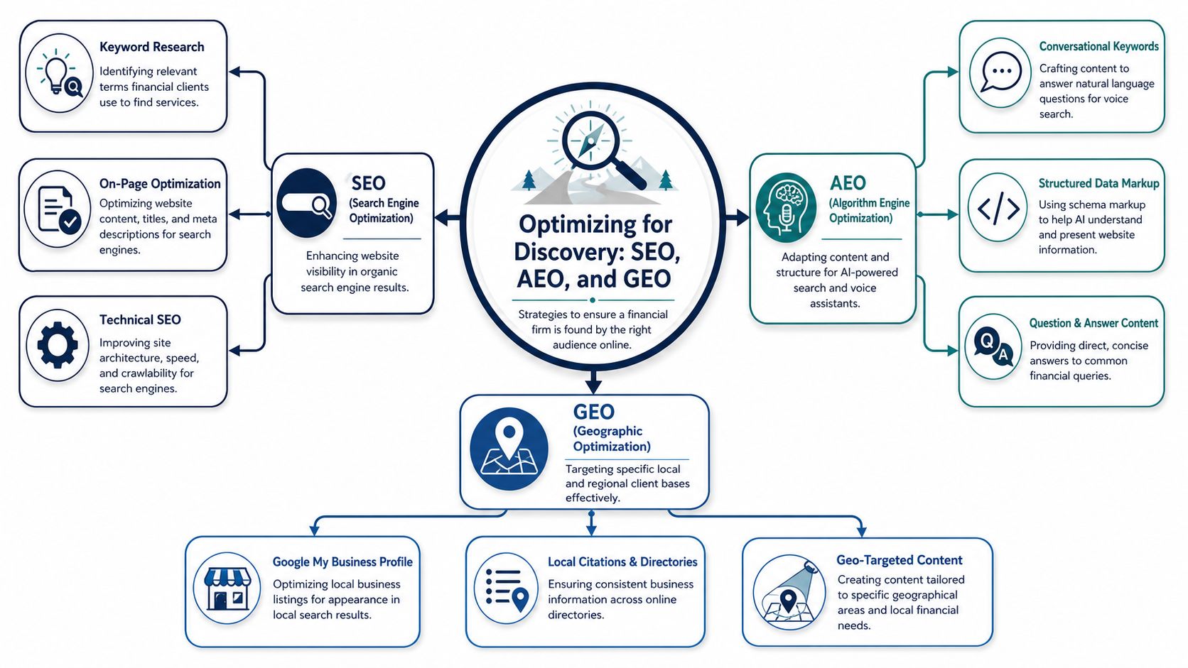
The firms that win search visibility in finance don't just publish more. They publish clearer, more organized, more relevant content. That difference matters.
The Compliance First Launch Process and Checklist
Launch day shouldn't feel like a scramble. For a financial firm, publishing a site is a controlled release that needs legal confidence, technical verification, and archived documentation before anything goes live.
Launch is a controlled review event
The final week before launch is where weak process usually shows up. Teams discover missing disclosures, inconsistent form language, mobile display issues, or broken consent flows when the deadline is already fixed. That happens when compliance has been treated as a final approval instead of a running requirement.
A better launch process assigns owners to distinct checks. Compliance reviews final copy and page context. Operations confirms routing and notifications. Marketing verifies analytics and event tracking. Development tests forms, browser behavior, redirects, and page rendering. Leadership signs off on the public version only after those checks are complete.
One requirement is especially important for RIAs. Registered Investment Advisors must maintain archive records of all website versions for at least five years, with the first two years kept readily available for regulatory review, and previous versions need to be saved before updates are made, as explained in this financial advisor website compliance guide.
Launch isn't the moment to ask whether the site is compliant. Launch is the moment to prove that the compliant version was the one approved, published, and archived.
What belongs on the final checklist
A useful pre-launch checklist is part quality control and part risk control. The most effective lists are short enough to use and strict enough to matter.
Core launch checks should include:
Content approval
Final page copy, disclosures, downloadable resources, and form labels should match the approved version exactly.Mobile review
Every key page should be checked on real devices for readability, spacing, button behavior, and disclosure visibility.Form verification
Required fields, consent language, confirmation messages, and routing paths should all be tested end to end.Tracking review
Analytics events should reflect meaningful business actions, not just pageviews.Archive capture
Save the approved site version and store it in a way the firm can retrieve later during review.
For teams that want a broader operational reference, this essential site launch guide is useful as a supplemental checklist. The value isn't in copying every item. It's in making sure the firm hasn't overlooked basic launch discipline while focusing on compliance detail.
A short decision grid helps during final approval:
| Review area | Sign-off question |
|---|---|
| Compliance | Is every public claim balanced and properly qualified |
| UX | Can a prospect understand the next step without confusion |
| Technical | Do pages, forms, and redirects work consistently |
| Measurement | Are key actions tracked in a usable way |
| Records | Has the approved version been archived before release |
Firms that treat launch this way usually avoid the painful cycle of immediate post-launch corrections. More important, they create a publish process that can be repeated safely for future updates.
Beyond Launch Analytics and Continuous Improvement
A financial website shouldn't be treated as finished once it goes live. The launch creates a baseline. The true value comes from watching how visitors behave, where they hesitate, and which pathways produce actual business conversations.
Measure the journey not just the form fill
Too many firms look only at total visits and contact submissions. That is not enough to guide meaningful improvement. A stronger analytics setup asks better questions. Which service pages attract qualified visitors. Which content paths lead to consultation requests. Where do users abandon the process. Which traffic sources bring curiosity but not trust.
Those questions matter because website performance is rarely a single-page issue. A homepage may introduce the firm well, but a service page may create confusion. An educational article may attract strong traffic, but the internal links may fail to move readers toward action. Analytics helps isolate those points.
For firms reviewing attribution models, the AdStellar AI insights on last-click attribution are helpful because they show why a single-touch view can distort how marketing channels support conversion. Financial buyers often take multiple visits before reaching out.
Use analytics to guide the next revision
Once measurement is in place, continuous improvement becomes practical instead of speculative. The firm can revise based on behavior, not opinion.
That usually means reviewing a small set of signals regularly:
- Entry pages that attract the right audience
- Engagement patterns that show where visitors continue reading
- Conversion paths that reveal which sequences lead to inquiry
- Drop-off points where users lose confidence or interest
- Content themes that deserve expansion because they align with actual demand
A useful first step is making sure the site is set up correctly from the start. This guide on how to add a site to Google Analytics is a practical reference for getting the measurement foundation in place before deeper analysis begins.
The best improvements are usually modest. A clearer call to action. A better placed disclosure. A shorter form. A revised service page heading. A stronger internal link from educational content to a consultation page. Small changes like those often have more impact than a full redesign because they remove friction at precise points.
The firms that get the most value from their website don't rebuild it every year. They review it, learn from it, and refine it with discipline.
That is the long-term advantage of a compliance-first website. It isn't just safer at launch. It is easier to improve responsibly because the structure, approval workflow, and measurement model were designed with change in mind from the beginning.
Advisor Momentum helps financial advisors, RIAs, wealth managers, and banking teams build compliant digital systems that support credibility and growth. For firms that need a website that can satisfy compliance review, generate stronger leads, and improve over time, Advisor Momentum provides compliance-ready web design, branding, content, SEO, and advisory-focused marketing support built for regulated financial organizations.
