

A bank marketing director rarely starts a redesign because the site looks old. The trigger is usually more urgent. Branch traffic has shifted, prospects are finding rates on their phones, compliance wants tighter disclosure placement, and the homepage still behaves like a brochure instead of a service channel.
That's why bank website design has to be treated as a compliance and conversion problem first, and a visual problem second. The strongest redesigns start with task flow, disclosure visibility, mobile speed, and trust signals, then layer brand on top. For a useful benchmark on structure and content discipline, proven web design strategies are a good place to compare process, even though banking adds a much heavier regulatory load.
Table of Contents
- Why Bank Website Design Is a Compliance and Conversion Problem First
- The Four Pillars Every Bank Site Must Balance
- Information Architecture and UX Patterns That Actually Work
- Regulatory and Compliance Requirements Built Into the Design
- Performance, Accessibility, and Security as One Technical Foundation
- Branding, Content, and Conversion Optimization in Regulated Environments
- Choosing a Compliance-Aware Agency or Vendor
- Practical Checklist and Phased Rollout for Your Bank Site
Why Bank Website Design Is a Compliance and Conversion Problem First
A community bank marketing lead, or an RIA team with a banking arm, often inherits the same problem. The site has rate pages, service pages, and a login path, but each one has grown independently, so the visitor has to work too hard to find anything. The redesign brief gets framed as a visual refresh, but the issue is that every page has to serve a human and satisfy a regulator at the same time.
That tension is not theoretical. One industry analysis found bank websites were 25% less usable than e-commerce sites such as Amazon and Walmart, and it framed the consumer demand around simplicity as the benchmark problem in banking UX, not just aesthetics (The Financial Brand). That matters because bank sites are judged against polished consumer platforms while also carrying account servicing, trust-building, and disclosure obligations.
Practical rule: if a homepage, product page, or rate page makes a visitor hunt for the next step, it is already underperforming, even if it looks polished.
A good redesign starts by mapping the actual jobs people do on the site, finding a rate, opening an account, checking login access, reading disclosures, or locating service details. The visual system follows that map. When teams reverse the order and lead with colors, stock imagery, or page animations, they usually end up redesigning the same friction in a nicer wrapper.
What changes the brief
The best bank sites are not built to impress a design review. They are built to reduce friction in regulated flows, make disclosures visible without clutter, and keep the site credible on a phone. That's why the design conversation has to move upstream to information hierarchy, page-level trust signals, and completion paths before anyone debates fonts or hero images.
The Four Pillars Every Bank Site Must Balance
The strongest banking sites usually sit on four connected pillars, user experience, regulatory compliance, security, and performance. A change in one area affects the others immediately. A loan calculator that sits too deep in the navigation hurts UX, but if it also collects information, it can trigger security review and content approval issues.
The pillar model helps teams avoid false trade-offs. A page can't be “more conversion-focused” if it hides required disclosures, loads slowly, or creates a layout that shifts when a user taps on it. In banking, the design system itself has to support trust, task completion, and legal clarity at the same time.
A bank site should behave like one system, not four disconnected checklists.
Use that lens to review every template. A homepage needs a clear path to account access and products. A product page needs visible terms and enough context for the user to act. A service page needs confidence-building language and straightforward navigation. If any pillar breaks, the rest of the page usually feels weaker too.
How the pillars interact in practice
A single CTA can expose the entire stack. If the button is too prominent but the disclosure is buried, compliance suffers. If the disclosure is visible but the page is overloaded, conversion suffers. If both are correct but the page is slow, the experience still fails. That's why bank website design works only when the four pillars are reviewed together, not handed to different teams in isolation.
Information Architecture and UX Patterns That Actually Work
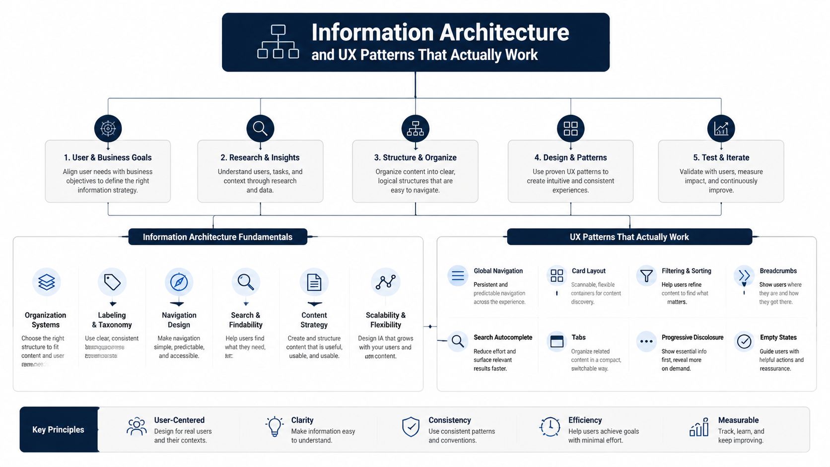
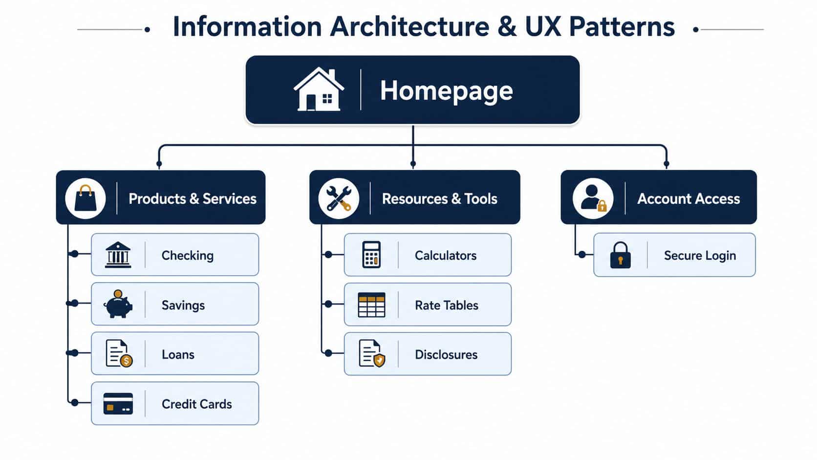
Bank navigation should answer the top tasks fast, not showcase internal organization. That usually means keeping the primary nav short, grouping products by user intent, and putting the most searched paths where people can reach them with one obvious action. On mobile, that matters even more because visitors are scanning for rates, locations, login, and service answers while moving through the site quickly.
The mobile pattern that works best is simple. Put key information near the top, keep the calls to action obvious, and avoid forcing extra clicks for basic journeys like opening an account or finding a branch. Guidance for bank sites also warns against pop-ups on mobile because they interrupt the task and frustrate users who already have limited screen space (CSI Web).
A practical nav model usually includes these patterns:
- One clear account access route: login shouldn't compete with marketing actions.
- Product grouping by need: checking, savings, loans, and cards should be easy to compare.
- Fast utility access: rates, disclosures, and calculators belong where people can reach them without digging.
- Minimal friction on mobile: one-click actions work better than long multi-step paths.
Product pages should do the work of three pages
A strong product page has to explain the offer, surface the terms, and move the visitor toward the next step. That's also where form behavior matters. When an application or lead form is part of the page, form backend best practices become relevant because the submission flow has to feel clean, secure, and easy to complete without adding confusion around errors or required fields.
Useful shortcut: if a page needs multiple expansions just to show the basic offer, the structure is too buried for banking users.
Homepage hierarchy should follow intent, not vanity. If users are mostly looking for rates, login, locations, and a few product entry points, those items need to be immediately visible. That doesn't mean cramming everything into the hero, it means designing the page so the first scroll answers the most common jobs before the user starts hunting.
Regulatory and Compliance Requirements Built Into the Design
A bank page is not finished when the copy is approved. It's finished when the required disclosures are visible, readable, and placed where the user sees them. In the U.K., current account, savings, mortgage, loan, and credit card pages should show APR or AER, a representative example, fees, and key terms without forcing the user to expand hidden sections.
In the U.S., the homepage and important service pages need Member FDIC displayed prominently, and rate ads need the applicable annual percentage rates and terms. Fee disclosures also have to be easy to find and written plainly, which makes disclosure layout and readability part of the design system rather than a legal afterthought (Growth Limit).
What belongs on the page itself
The design team should treat these items as visual elements, not footer leftovers.
- Brand and trust markers: FDIC, FCA, and FSCS signals should sit where users can see them during evaluation.
- Product terms: APR, AER, representative examples, and fees belong on the relevant product page.
- Plain-language disclosure blocks: avoid burying important conditions in tiny expandable text.
- Accessible service links: users should not have to guess where policy, fee, or eligibility information lives.
That visibility affects scannability and page length. It also shapes button placement because a CTA that sits too close to a dense disclosure block can feel pushy, while a CTA that sits too far away can lose momentum. Good compliance design creates enough breathing room for both clarity and action.
For lead-generation workflows, the consent path matters too. If a form or callback flow is used, Growform's guide to 1-1 consent is a useful reference for structuring compliant intent capture without making the user read a legal wall first.
Disclosure visibility is not a cleanup task. It is part of the page experience.
Plain language reduces review friction
Compliance teams move faster when content is written in direct language. That doesn't mean oversimplifying risk. It means putting the important terms in front of the user cleanly, using the same labels the institution can stand behind in review, and avoiding clever marketing copy that creates rework later.
Performance, Accessibility, and Security as One Technical Foundation
A bank site can look credible and still fail if it loads slowly, shifts around on mobile, or creates barriers for keyboard and screen-reader users. The technical foundation has to connect speed, accessibility, and secure handling from the start. For bank websites, a defensible performance target is Largest Contentful Paint under 2.5 seconds, First Input Delay under 100 ms, and Cumulative Layout Shift under 0.1 (CSP).
That performance standard lines up with how people use bank sites today. Across web design research, 58%+ of Google searches happen on mobile devices, 77% of retail website traffic comes from smartphones, and about 90% of websites now use responsive design, which shows why a bank homepage has to work first on mobile, not as an afterthought. The same research also notes responsive sites register 11% higher conversion rates, and mobile-optimized sites can see up to 40% higher conversion rates than non-optimized sites.
Priorities that pay back
The technical checklist should be direct.
| Metric or Standard | Target | Why It Matters |
|---|---|---|
| Largest Contentful Paint | Under 2.5 seconds | Keeps the main content visible fast enough to hold attention |
| First Input Delay | Under 100 ms | Makes taps, clicks, and form actions feel responsive |
| Cumulative Layout Shift | Under 0.1 | Prevents buttons and text from moving while users read or act |
| WCAG 2.2 Level AA | Full alignment | Supports accessible navigation and readable content |
| OWASP-aligned security hygiene | Required baseline | Protects forms, document handling, and user trust |
The remediation stack is straightforward. Compress images to WebP, lazy-load content below the fold, split long JavaScript tasks, use a CDN, and reserve explicit dimensions for media so pages don't jump. Those changes help performance, but they also reduce user errors and abandonment on mobile connections.
Inclusive delivery has to be designed in
A more overlooked issue is designing for low-bandwidth and digitally marginalized users. HCI research on inclusive banking experiences points to USSD/SMS alternatives, lightweight pages, offline functionality, progressive disclosure, and culturally familiar UI cues because mainstream banking UX often assumes strong connectivity and high digital literacy (UX Matters). That's not a niche concern, it's a design reality in underserved markets.
Branding, Content, and Conversion Optimization in Regulated Environments
Strong branding in banking isn't about sounding premium. It's about making the institution feel consistent, trustworthy, and easy to understand across every page, whether the visitor is reading a rate page, an educational article, or an account-opening flow. The most effective trust signals are practical, not decorative, and they work best when they sit close to the decision point.
That means using license badges, advisor photos where appropriate, and compliance-reviewed testimonials sparingly and with purpose. It also means organizing calls to action so they match the user's readiness, open, apply, contact, learn more, rather than forcing one hard conversion path onto every visitor. A bank site should give people a clear next step without sounding like a sales page.
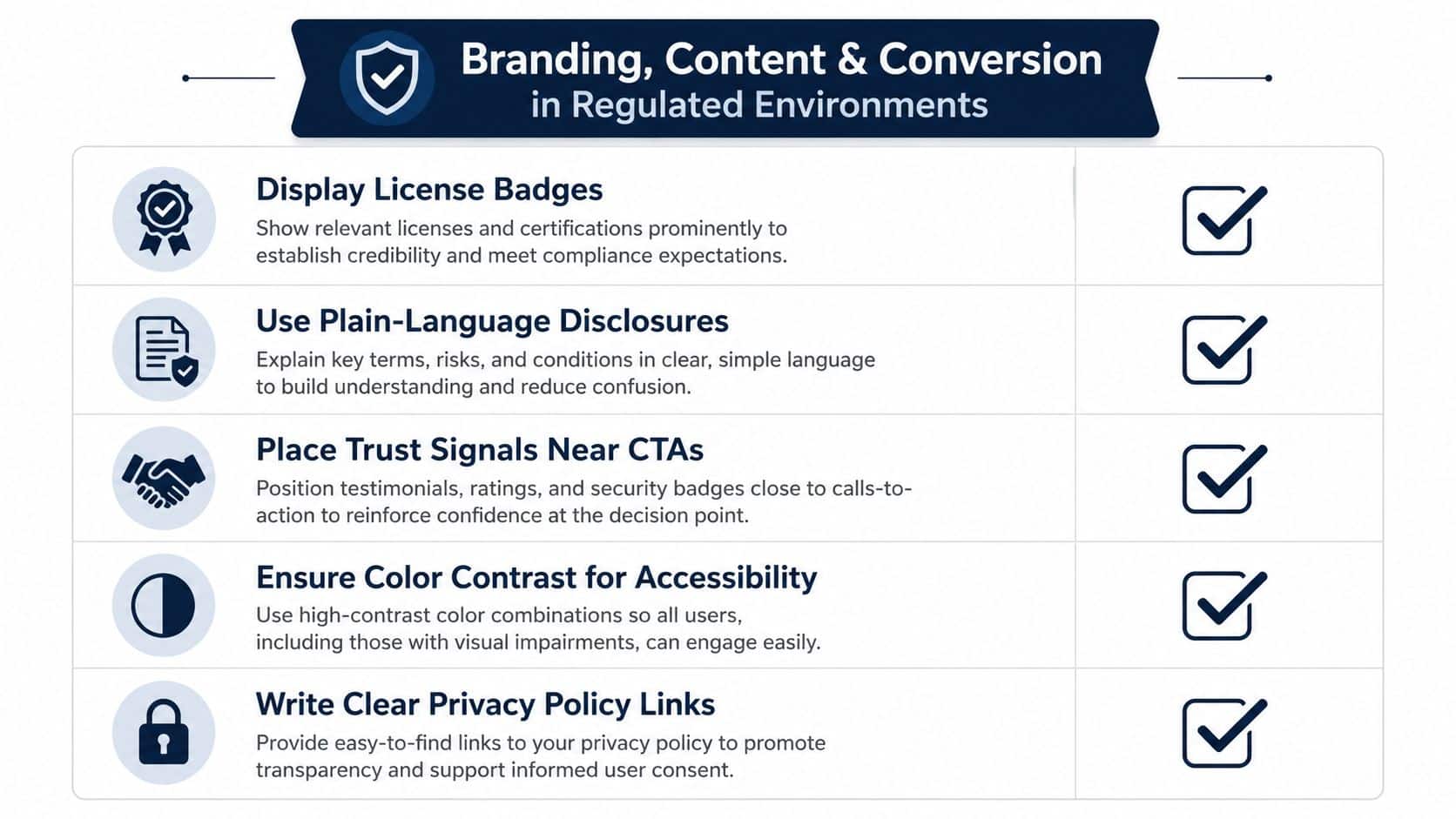
Content workflow matters just as much as visual consistency. Banks and RIAs that separate brand copy from compliance review usually create needless back-and-forth. A tighter workflow, where content is planned with disclosure requirements and audience intent in mind, cuts the number of edits that happen after the page is already designed.
The same logic applies to inclusive content. Low-bandwidth visitors need lightweight pages, multilingual support where appropriate, and culturally familiar UI cues that don't assume everyone interacts the same way. Those choices are not peripheral. They shape whether the site feels usable in the markets the institution serves.
Content should support conversion without fighting review
One practical model is to treat educational content as part of the onboarding journey. Articles, landing pages, and video explainers can answer pre-decision questions before the visitor reaches a product page. That lowers friction later because the user has already seen the institution explain complex topics in plain language.
For agencies building that kind of system, Advisor Momentum's branding for financial services is one example of how a regulated firm can connect brand structure to downstream marketing without treating the site as a stand-alone creative exercise.
Choosing a Compliance-Aware Agency or Vendor
A bank website vendor is not just a design supplier. It becomes part of the institution's risk surface, because the agency has to understand disclosure placement, regulated copy, mobile behavior, and review cycles. A generalist team can make a site look modern, but that doesn't guarantee the structure will survive compliance review or support lead generation cleanly.
The better filter is simple. Look for regulated-industry experience, clear familiarity with compliance workflows, and end-to-end capability from brand through lead generation. It also helps when the team includes compliance leadership and understands state-specific considerations across a nationwide footprint, because the site will almost always touch more than one audience and one rule set.
A bank or RIA should ask for three things in an RFP:
- Evidence of regulated work: not just polished screenshots, but process detail.
- Workflow clarity: how content moves from draft to review to launch.
- Conversion thinking: how the vendor handles forms, CTAs, and onboarding paths.
Advisor Momentum is one example of a provider that combines bank marketing agency services with website design, content, branding, and compliance-first execution for financial firms.
If a proposal can't explain how it handles review cycles, it isn't ready for a regulated client.
Red flags show up quickly. Vague timelines, generic portfolio language, and a fixation on visuals without disclosure planning usually signal a poor fit. The right partner talks about structure, governance, and task completion before talking about page effects.
Practical Checklist and Phased Rollout for Your Bank Site
A bank redesign goes smoother when the work is staged. Discovery should identify the highest-traffic journeys, the disclosure load, and the pages that cause the most user drop-off. Design then turns those findings into templates, while build and review make sure the content, forms, and performance targets still hold under real conditions.
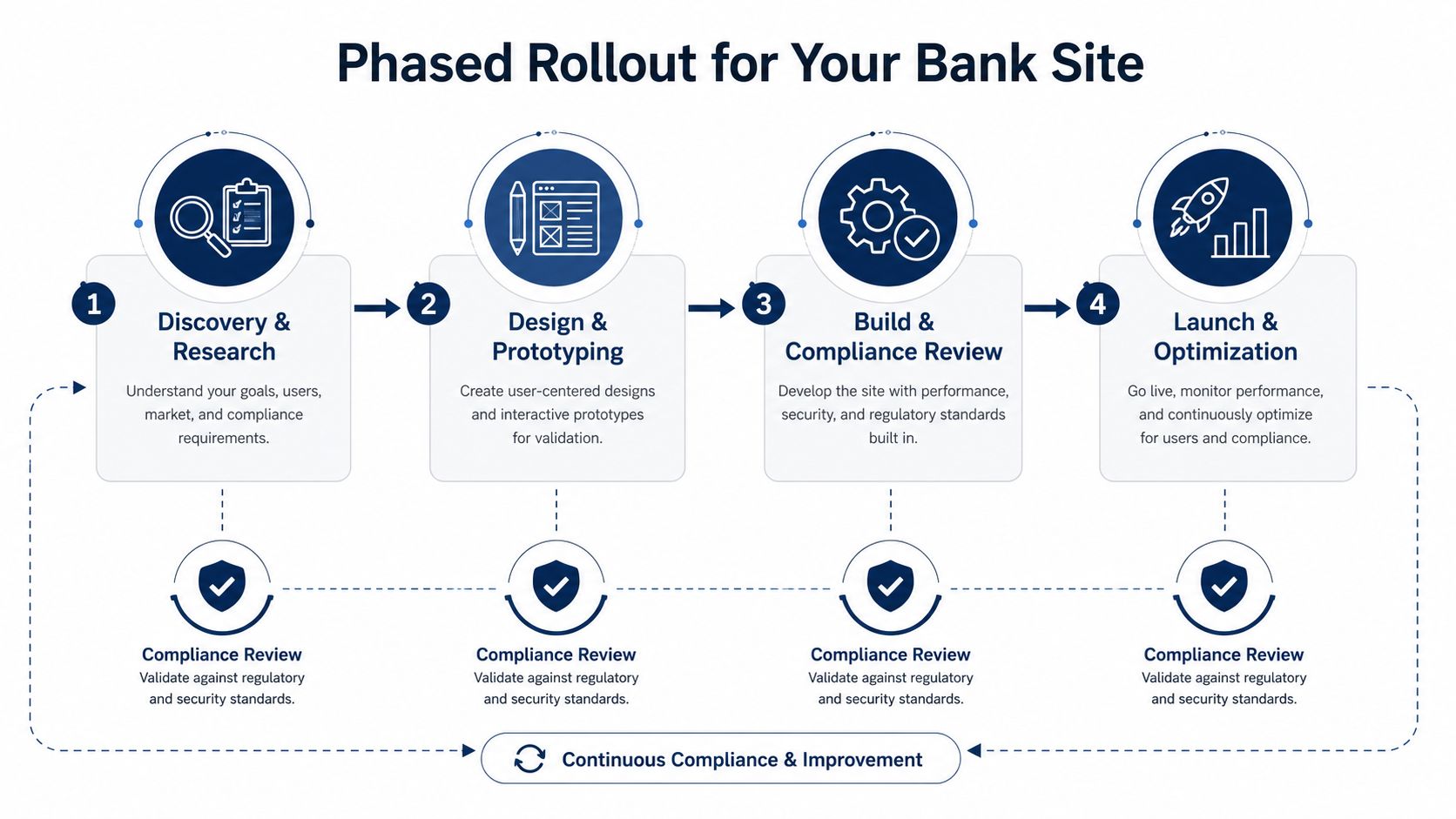
A practical launch checklist usually includes these items:
- Confirm disclosure placement. Member FDIC, APR or AER, representative examples, fees, and key terms should appear where they belong.
- Simplify the mobile CTA set. The user should not have to guess whether to login, apply, or contact.
- Audit the homepage hierarchy. The most common tasks need the shortest path.
- Test performance and layout stability. Speed and visual shifts affect confidence fast.
- Review accessibility and security. WCAG 2.2 AA alignment and OWASP-aware handling should be in the launch gate.
The post-launch loop matters as much as the build. Teams should keep checking Core Web Vitals, conversion paths, and disclosure visibility after launch so the site doesn't drift back into clutter. The goal is a site that loads quickly, reads clearly, and keeps compliance visible without turning every page into a legal memo.
Advisor Momentum helps banks, RIAs, and wealth firms turn site redesigns into regulated growth systems, with website design, branding, content, and compliance-first execution tied together. For teams that need a site that can pass review and still move visitors toward action, visit Advisor Momentum and explore how a financial-services-specific process can support the next redesign.
